


Overview
The CVS Pharmacy dashboard is a page that allows folks to have a brief overview of their prescriptions, orders, alerts and more. Some users have described this page as clunky, redundant and we found that 50% of our users are going directly to their all prescriptions page from one of 3 different links.
Furthermore, we have new competition in the digital pharmacy space with Amazon Pharmacy, Pillpack and Capsule who all have new streamlined experiences for their users.
Our objectives were to thoroughly research our competition and to design a better overall dashboard for our users.
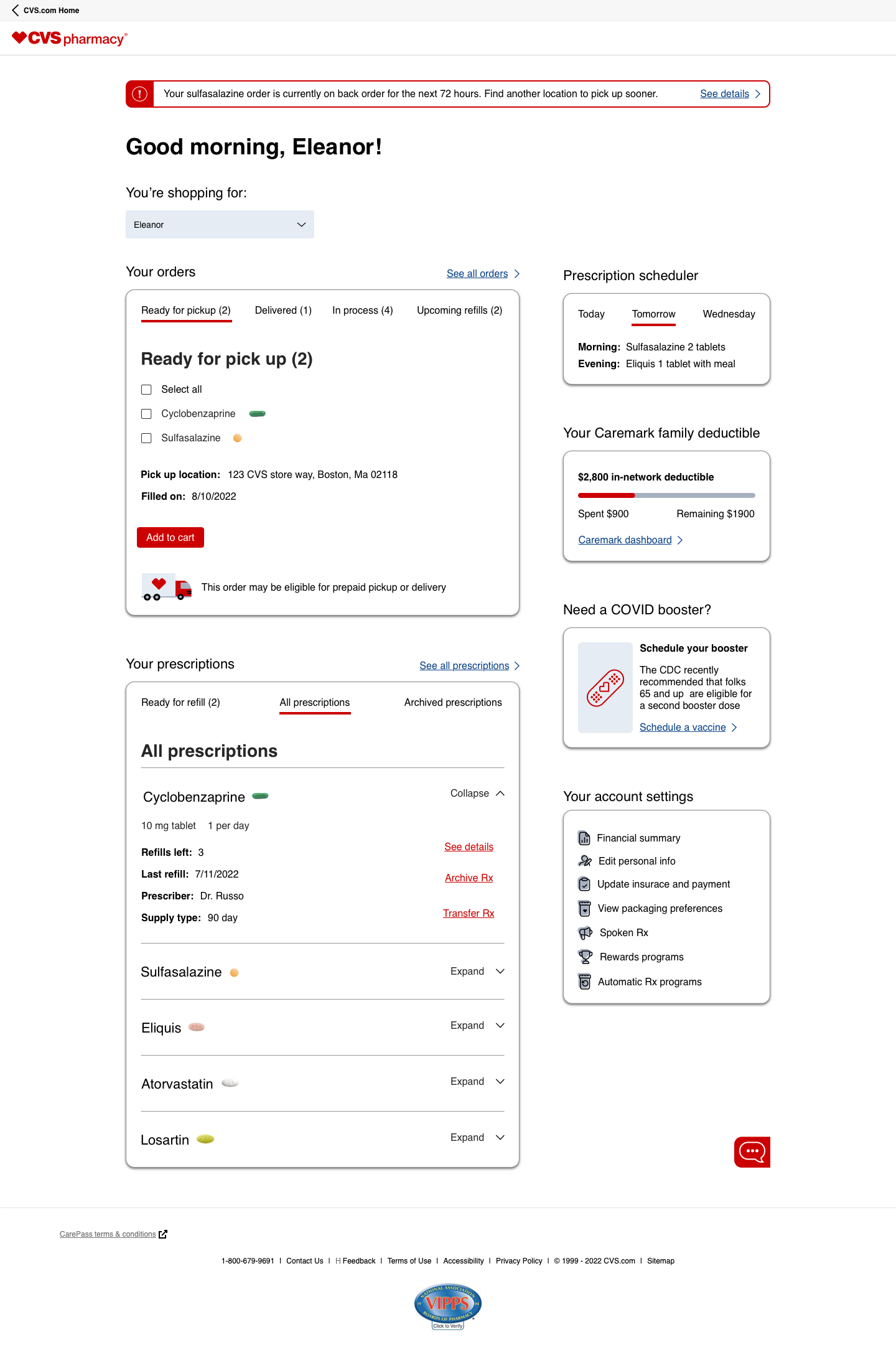
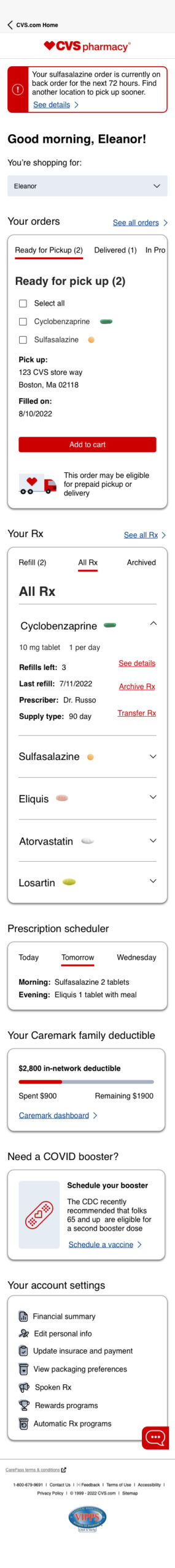
Our competitor’s dashboards and our own (hover for automatic slideshow):
Competitor analysis
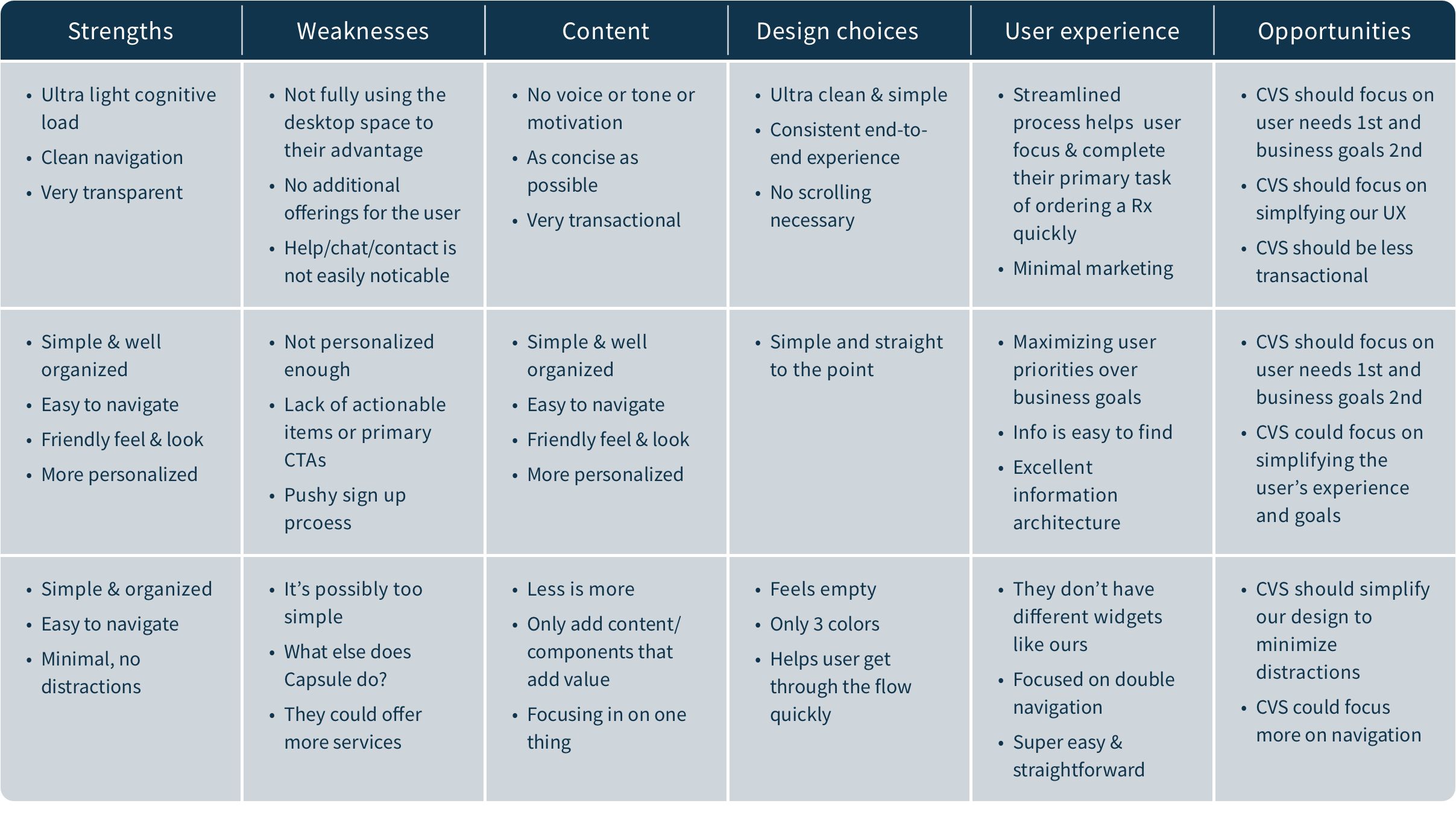
Leading our team for this activity, I had our group analyze our primary competitors websites. For each website we would examine what we perceived as strengths, weaknesses, content decisions, UI decisions, overall experience, and ideas that we could borrow or improve upon.
Some of the sites we reviewed were Walgreens, Pillpack, Capsule, Amazon Pharmacy, Good Rx and our own last. However, we did not include Walgreens in our SWOT analysis because Walgreens does not have a traditional pharmacy dashboard but instead a menu dropdown from their retail homepage. We also chose to omit Good Rx because they’re not exactly a competitor and sometimes refer users to our own site.
Our “SWOT” analysis findings:
Creating a feature checklist
To give us an idea of what features to consider adding or removing for our redesign we created a features checklist from our competitors sites and how they stacked up to our own dashboard:
")
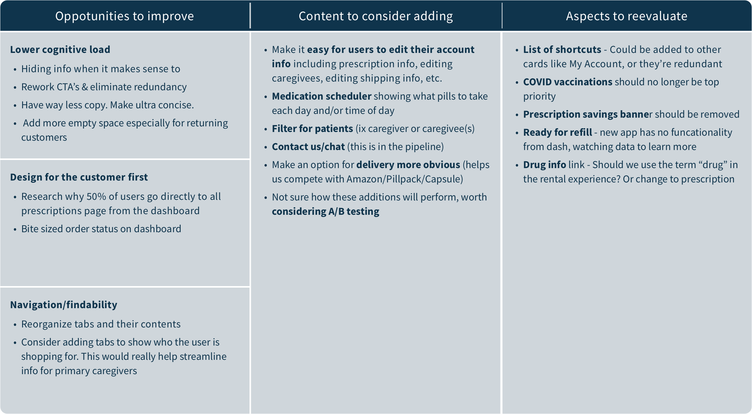
What to add, remove or improve?
Then we summarized our findings from this assignment and presented them to our management team.
Ideation and wires
Next we conducted 3 rounds of design sessions where each person from our team spent 30 mins designing a wire and then presented our ideas to the team. We would then discuss what we ideas we thought worked well or didn’t work well in each design.
My wireframe draft #1 mocked up
Some of the ideas to my design included:
-
Lots of white space, concise copy and a minimalistic approach to match our competition and simplify our user’s experience.
-
an account section so users could easily update their personal information, packaging preferences, and more.
-
a three day preview to help users keep track of doses and actionable tasks like when they need to renew a prescription.
-
Compress and simplify the current (in-app) orders section from 4 sections to one.
Back to top