Code for Boston
Starting out
Starting out
Further info screens
Prototype
Progress tracker
Usability testing
Further info screens
Full screen
Prototype

I joined forces with a team at Code for Boston that was developing a social security calculator. This calculators purpose directly helps government employees better predict and understand their social security income in retirement. Employees don’t always receive full government benefits and the social security website can be confusing. So our team’s goal was to create a simpler calculator that explains how their results are determined.


Starting out
When I heard about the project I was immediately interested because it was a unique problem and I felt I could make a difference. I was the only designer on a team of developers. Once a week, we would meet up in Cambridge for a few hours after work to develop the site.
To start off the project, I needed to better understand our problem. So I conducted an analysis of the current Social Security calculator and was briefed on certain pain points.

Key points
- The government doesn’t always make the correct deductions when employees first enter retirement. When this happens, the government can catch on years later and make an employee pay back their “incorrectly calculated benefits” to the government or cut them off from their benefits until the difference is paid off. But, the government only catches 85% of the employees with incorrectly calculated benefits. This is a huge problem. (Also a mouth full. Sorry for all the reading!)
- The current site is confusing with many different explanations and the user needs to sift through all of it to calculate their own correct calculations. (hopefully)
- Many users call Social Security’s phone line for better explanations which can be time consuming, frustrating and also expends government resources.
- There are few competitors or alternative sites offering Windfall Elimination calculators
After I learned about the goals for our site I wrote down the problem and solution statement to better define the issues.
Problem statement
Government workers and retirees need a way to 1. determine if they are affected by Windfall Elimination, 2. what their income is (or will be) and 3. how their income is calculated and because it’s currently a confusing process.
Solution statement
We believe that by creating an intuitive site that calculates social security income specifically for each user, while also explaining how it’s calculated, we will allow government workers and retirees to better understand their retirement income allowing them to be more informed and plan better financially.
We will know this to be true when we see usage of the site to reach 3000+ users within its first 6 months and receive a positive NPS (Net Promotor Score) of at least 75% from surveys.
States affected by windfall elimination

Creation of the progress tracker
- When I first came to the site, I noticed there were several screens but no real way for the user to know where they were in the process. They could either be on step 3 of 3 OR step 3 of 50. To remedy this, I developed a progress tracker which evolved over time. You can see the different looks below:
Sketched progress tracker
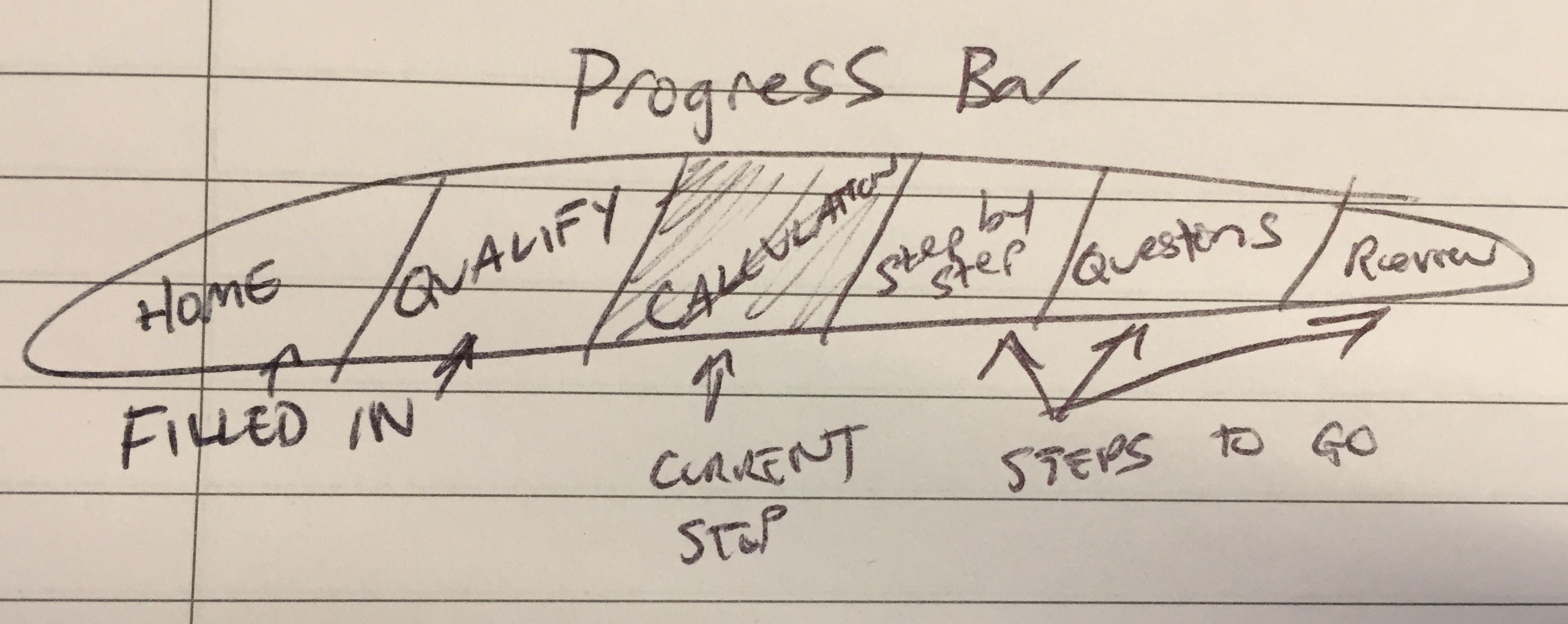
What the final version of the progress tracker will look like:

Progress tracker – next steps
We want to test the design of our progress tracker by creating a second version of it to perform an A/B test for our users. The second prototype will show our process in a slightly different way. Instead of a progress tracker along the top of the page, we will implement a “checklist” of objectives on the left side of the screen that will be “checked off” as users go through their calculation. We plan to do more rounds of usability testing and iterations to ensure a great experience for our users. A freshly minted mockup is coming to this case study soon…
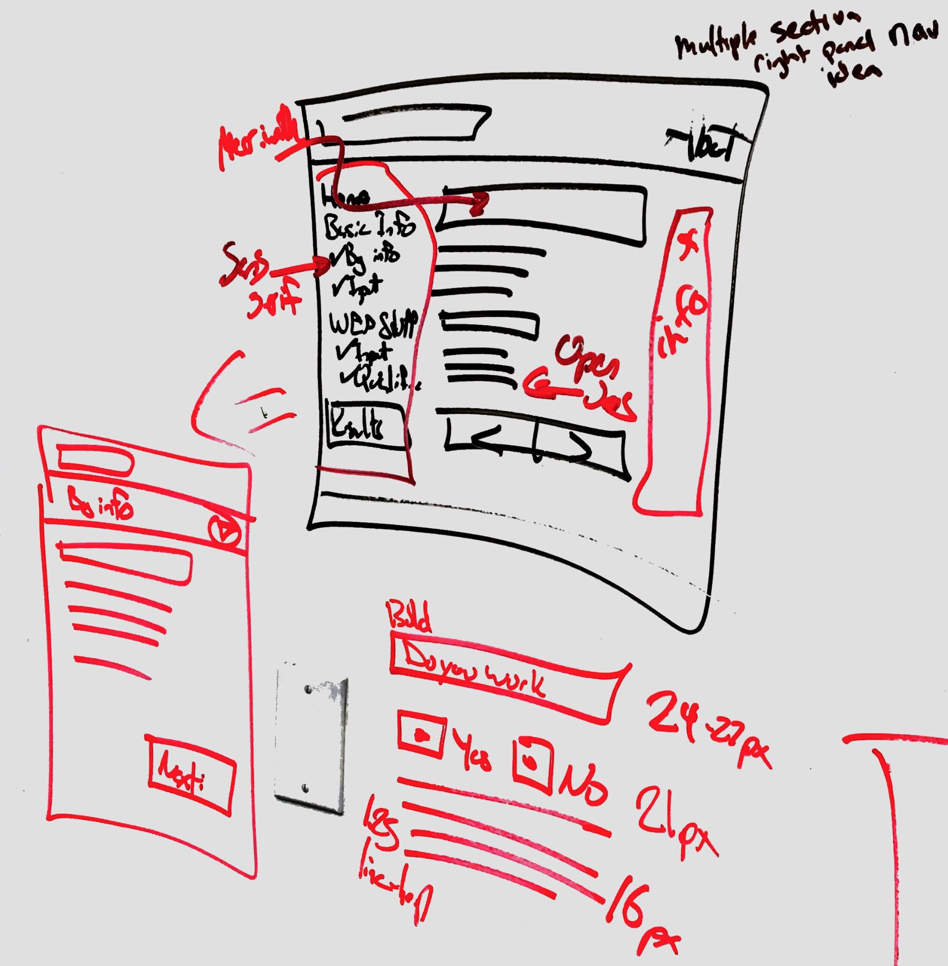
Rough sketch of “checklist” navigation on left side of the screen
Adjustable text size
The next thing I was concerned about was the accessibility and text size of the site especially since many of our users are older. To remedy this issue, we added buttons for the user to control the text size. The look of these buttons has changed over time and is still not finalized.
Feedback
- For personas, people who had already retired said this wasn’t as helpful to them, but they would have used it when they were planning their retirement. So we decided to focus on the behaviors of users in the 55-67 age range instead of post-retirement.
- The text in the first screen and the qualification screen still needs some editing for clarification.
- Many users are afraid to give out their personal information for this assignment because they don’t want their benefits taken from them if they somehow miscalculated their own benefits.
- Two ideas for further iterations: some users said they would like to see the sum of their non-covered pension and their SSA benefits to make budgeting easier; also there are some misconceptions about how much WEP can reduce your benefits, so it might help to present the WEP difference as a percentage in addition to a dollar amount.
Content strategy and accessibility
We are determined to simplify a complex process with plenty of financial, technical and legal terms and make them as simple as possible for our users and to leave them with a positive feeling. We even changed the name of the government term “Windfall Elimination” to “Windfall Awareness” to evoke a more positive connotation for our site. We aim to deliver the most intuitive site possible for all of our users so they understand why and how their income is determined. We also want our users to know that they are safe using our site because their information will be kept confidential. We are consulting lawyers, government agencies and technical resources to make sure our facts are solid and we provide a great experience for our users.
We are also designing our site with screen readers in mind. We are thinking about including tool tips for terms that need to be better defined but tooltips are more difficult for screen readers to scan. So we are considering alternative methods of displaying difficult terms like a glossary on the right side of the screen. We are still determining the best way to achieve this goal.
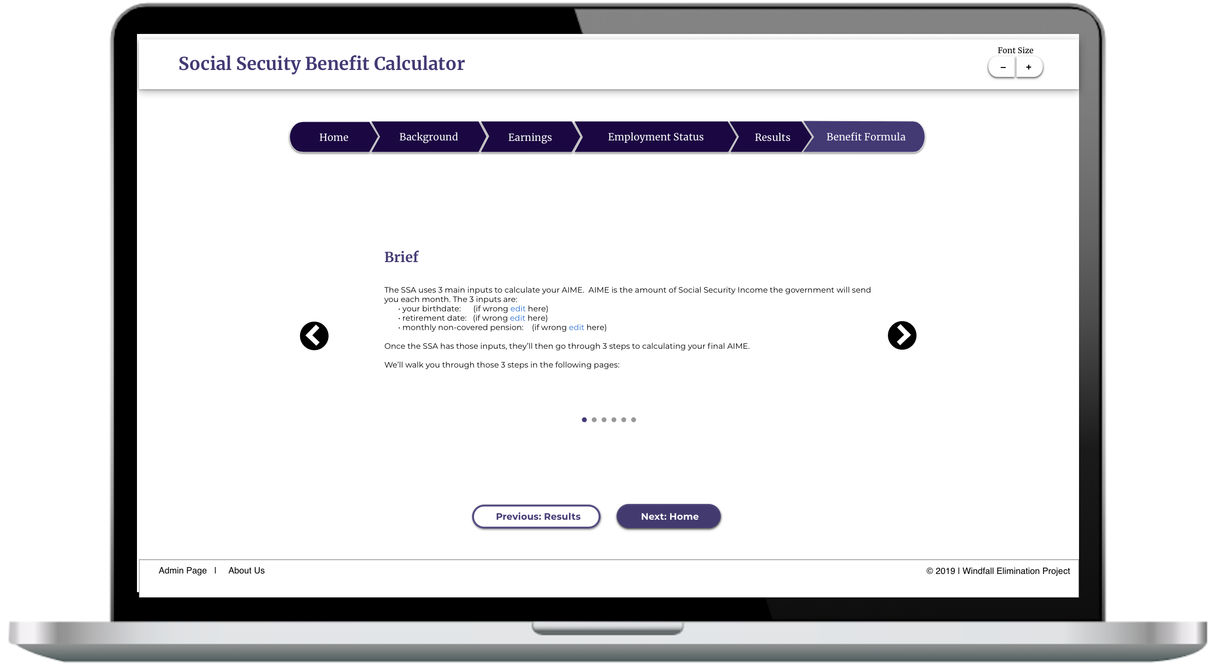
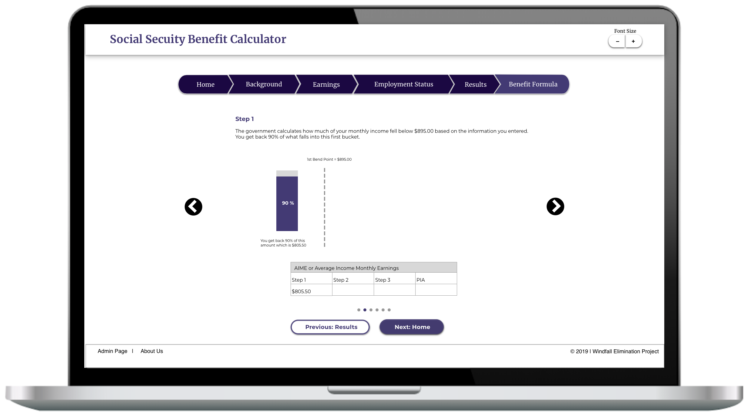
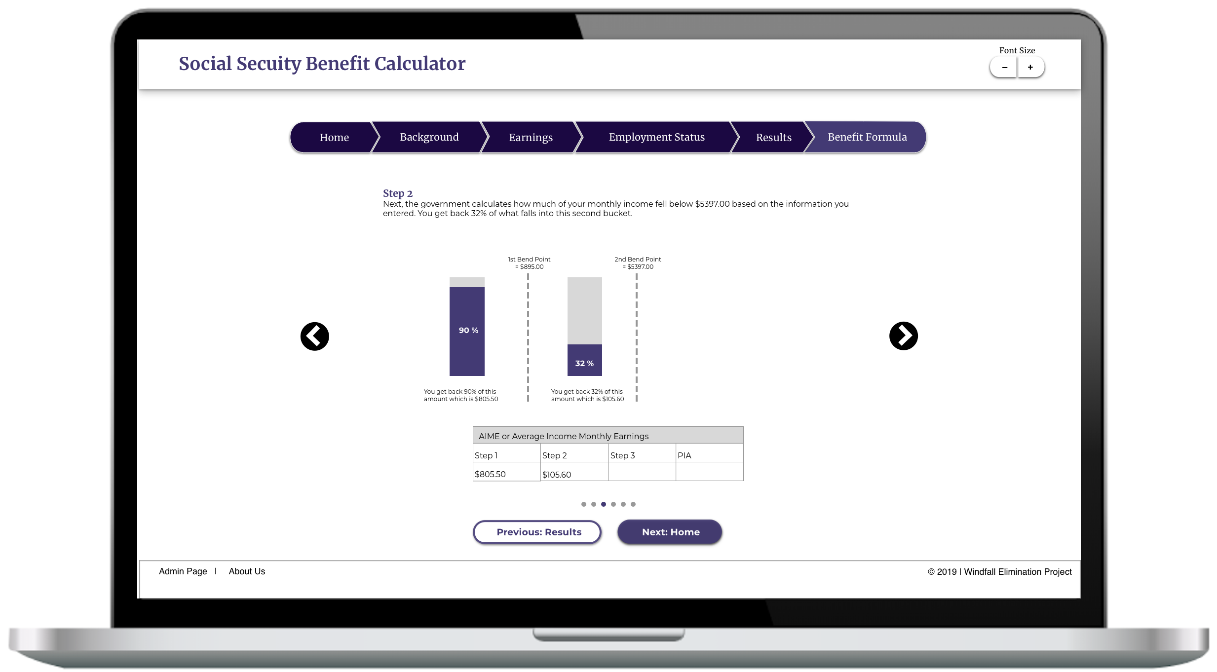
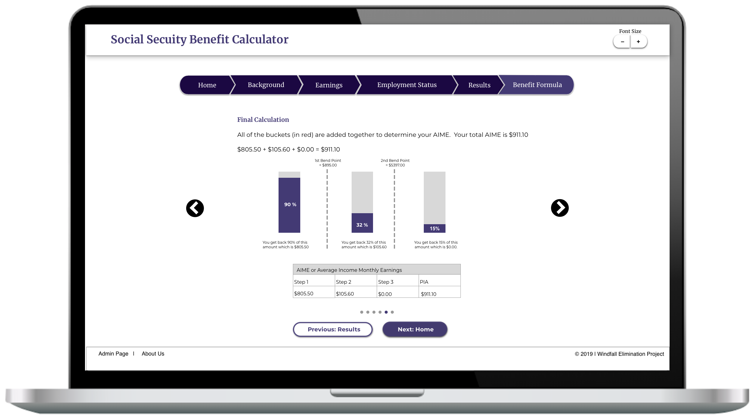
Further info pages
We wanted to simplify how social security income is calculated for our users, so we broke down the calculation of their income into smaller steps. This allows our users to easily the process.
Mid-fi look
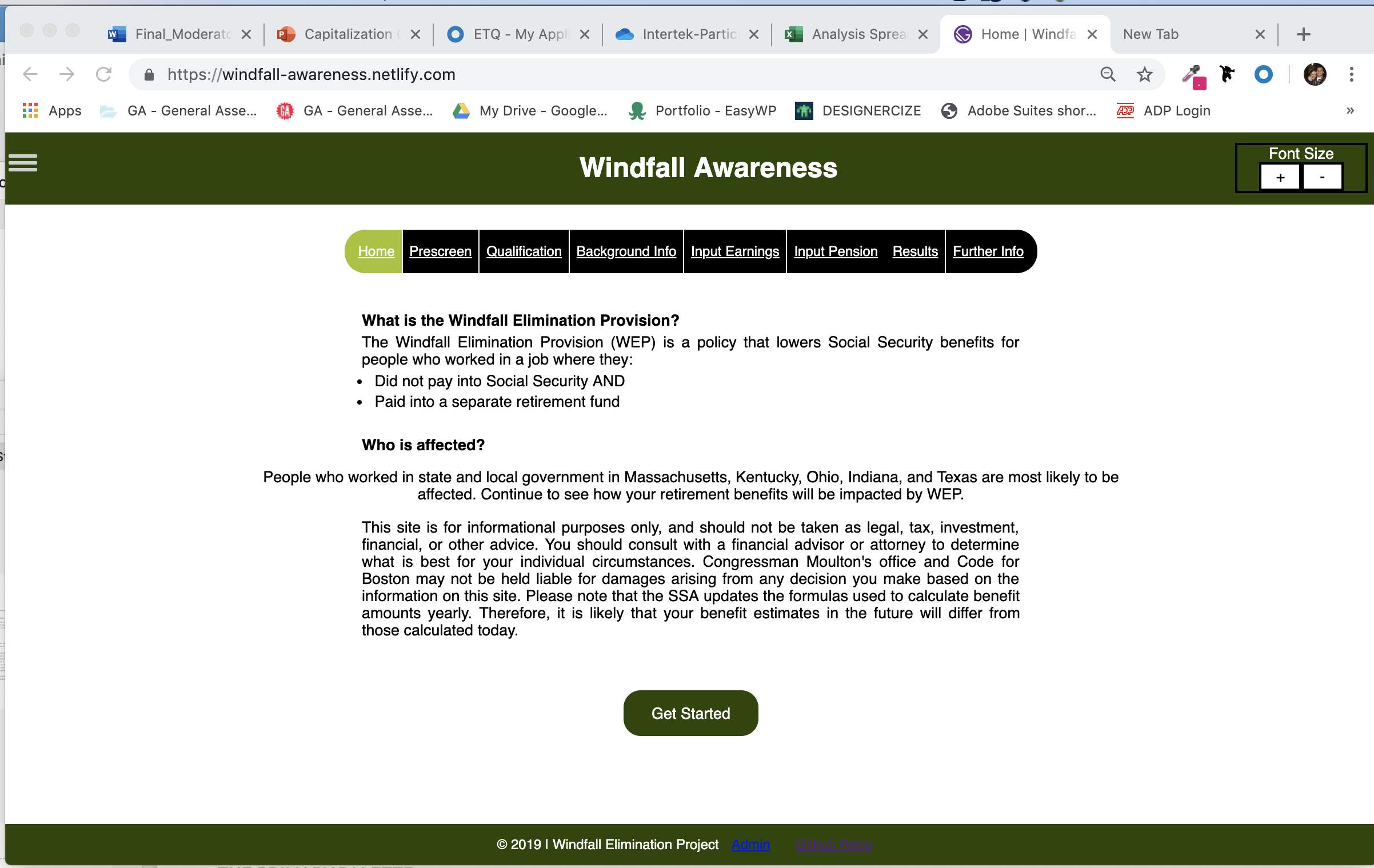
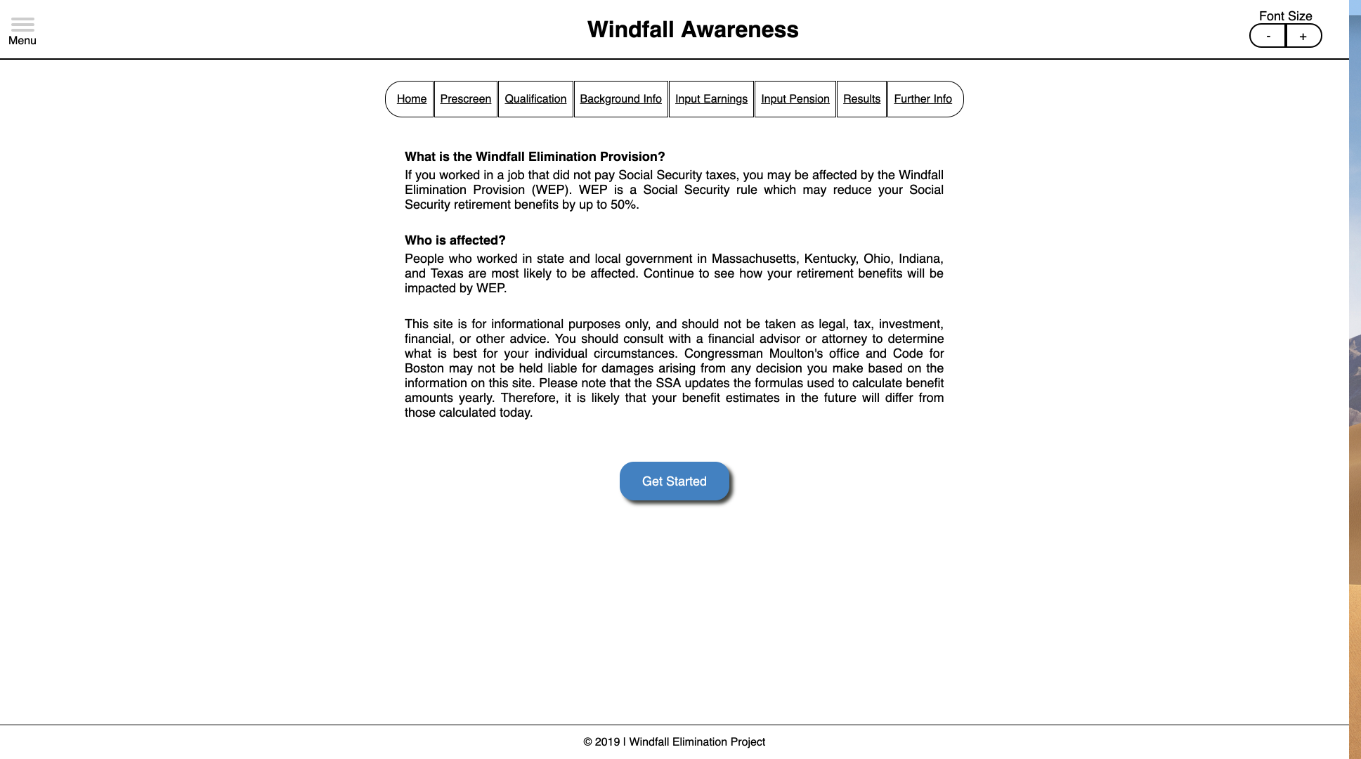
Current prototype
The team of developers and I created below prototype so we could get started on usability testing. The current version is more of a mid-fidelity prototype.
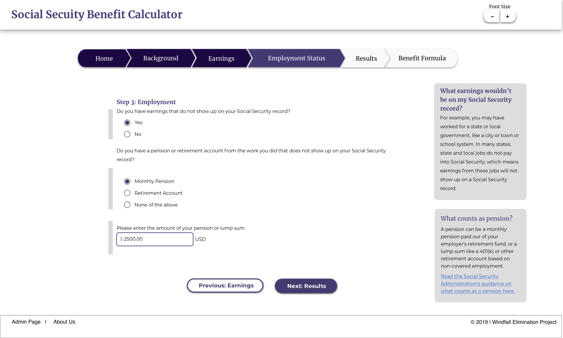
High fidelity goal
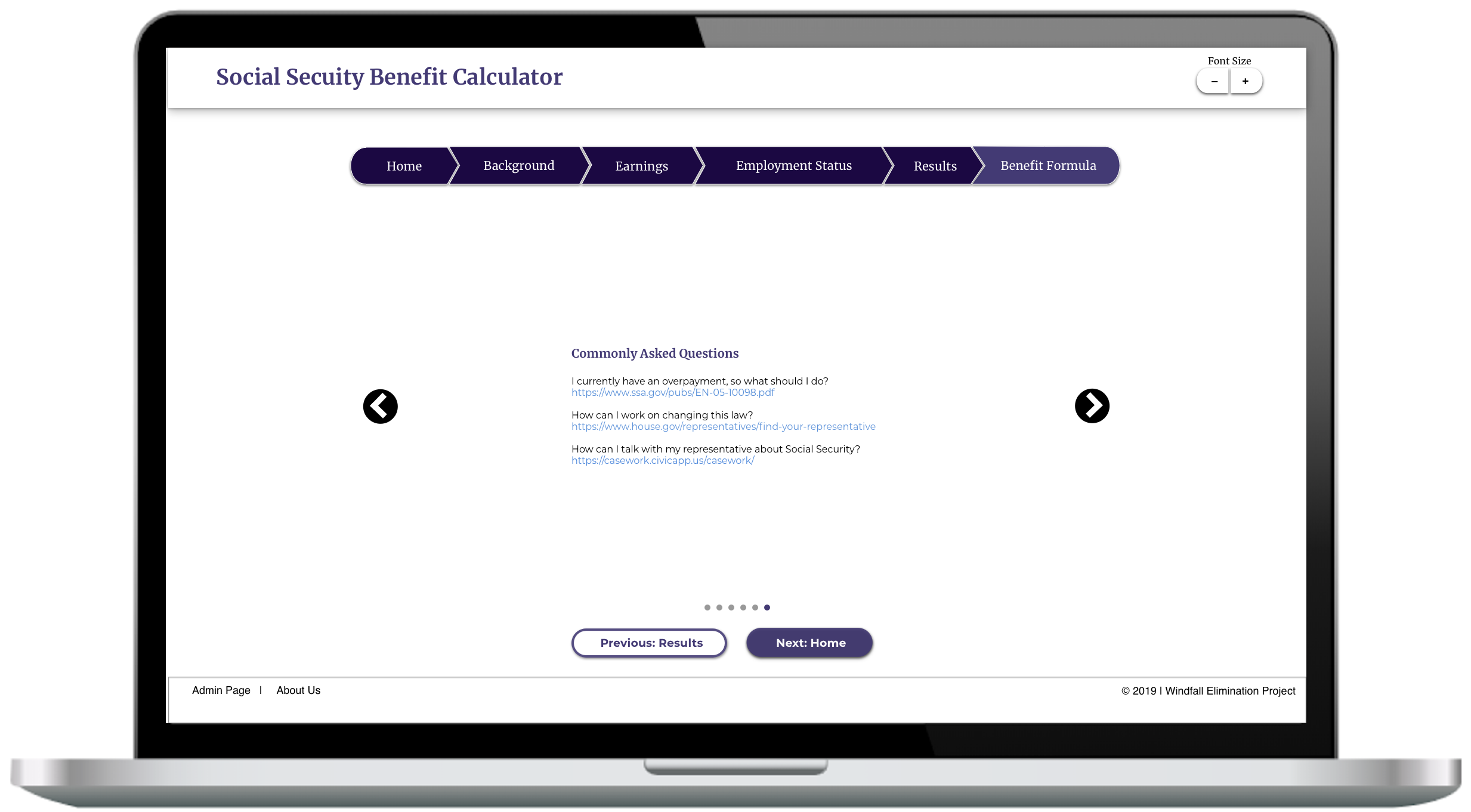
The screen shot below shows what the high fidelity version of the prototype will look like once we’re done.
Next steps
- We are adding a financial calculator at the end to pair up with our social security calculator.
- We need to work more on context and clarification for our users
- We need to add a page more thoroughly stating the confidentially of using our site to ensure safety for our users.
- We want to create a second prototype of the the progress tracker to A/B test.
- We are also working out minor tweaks and adjusting the whole flow of the site.
Check out our interactive Mid-fi prototype
Back to top

