Flat finder


Overview
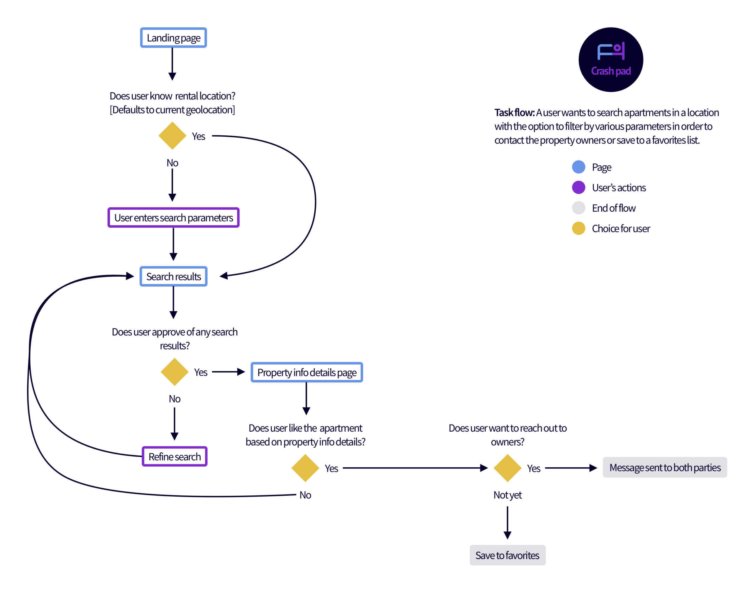
The objective of this project was to design a modern, fun, apartment finder tool geared mainly towards zoomers and millennials. To start out, I analyzed a dozen companies in this space and pulled out details I liked or didn’t like from them. [Note: early on my brandname was CrashPad which changed due to user feedback.] From there I built out a primary user flow to get started:

Low fidelity wireframes
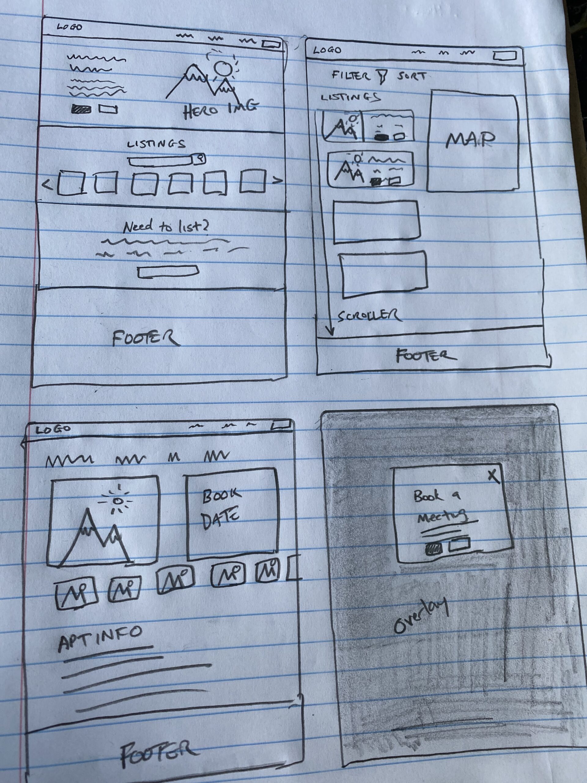
From here I started to sketch out some paper screens of the above flow to quickly devise a blueprint and catch any problems at an early stage which make any iterations quick and easy.

Creating a style guide
From here I started designing my mid-high fidelity wires with some icons, buttons, dummy copy and created a style guide after creating the home page to help the rest of the designs go faster and also maintain conisistency. Check out my final version of the style guide below:

Rough draft 1: Complete
After piecing together the first round of the prototype, it was off to user testing. See some of my first draft below:
Feedback and iterations
Some feedback I received was the hero image looks nice, but doesn’t make an emotional connection. Also there’s a Christmas tree in the mirror and it’s July. And folks did not love my original name of “CrashPad” because it’s not a familiar slang term in Massachusetts and the word “crash” invokes a negative connotation. And lastly, users thought the map on the search results screen was cramped and too small. It didn’t show enough info.
Check out the end result and prototype:
Although it’s not a full website design, this takes the user through several key pages from the home page to search to product details and even scheduling an appointment.

In hindsight and potential future steps:
Looking back on this assignment I do think it comes across as modern, trendy and professional and lives up to it’s competition in many ways. However, I think it needs to differentiate and build a competitive advantage to truly disrupt the digital apartment finder market. And ideally it would be even more in tune with what zoomers and millennials are truly looking for in an apartment.
Back to top
