ETQ – Text wrapping solution and reference guide
Text wrapping issue
Text wrap handoff
Reference guide issue
Reference guide handoff
Other projects
Text wrap handoff
Reference guide issue
Reference guide handoff
Other projects

ETQ (Excellence Through Quality) is a leader in the quality management software industry. Their software named “Reliance”, helps large companies with complex operations run more smoothly and efficiently. Their software is highly configurable which allows companies to tailor ETQ’s software to fit their needs.
The first issue I was asked to look into was how should ETQ commit to text wrapping and truncation inside their tables? It was a simple question that had many layers to it. So let’s dive into the details.

1) Text wrapping solution
Tables play an essential role in organizing the data inside Reliance (as you would expect). Our VP of Product Management asked me to come up with a solution for how the columns should be sized, how much text should be visible inside the table cells and determine the best way for users to scan content. One user even brought up a good point from our usability test:
In Views: “Something that would also be good is if these columns would auto size for the name that’s on there to get rid of the rest of the options. It would look more professional if the columns were auto size for the data that’s in there.” – test participant
Originally, the column widths were all 169 pixels wide regardless of the amount of text inside each cell/column. Now, column widths could be manually adjusted if the user dragged the column border or edited the standard width in settings. However, in the original settings, the user only had a field box stating Column Width = 169. There was not an indicator defining whether or not this was characters, pixels, pt, em, etc. The user just needed to take their best guess. After some digging, I confirmed this setting was calculated in pixels which is not ideal for estimating widths because every monitor is different and there are few users who know best practices for pixels. I feel that characters are a better option here because they’re an easier measurement to estimate for non-tech savvy folks. And I added this label of measurement in the settings screen so users knew what they were getting into.
Original column width settings

The next issue at hand: Any changes to the column settings would affect every column simultaneously. So one column could have one word per cell, while another column would have a long paragraph or more in each cell. In this situation, both columns would have the same width. You can see it at work in the screenshot below.
Column width settings
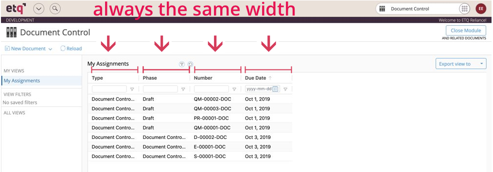
After conducting research online, I discovered the best practice was to have the columns auto-expand to fit the width of the text. This auto-expand would work up a certain character limit before truncation occurs and ellipses cuts-off the remaining text. Although this ideal character limit before truncation is up for debate, I determined that 40 characters before truncation occur would work well enough for most Reliance users. But, how should users better scan cells with larger text amounts?
I came up with two different solutions: tooltips and an expand/collapse rows button. I A/B tested these two options with 19 users and found some interesting results. Although tooltips were the more favorable option, we still needed to account for our users who regularly use tablets and other touch screen devices. You see, tooltips could only work for touch screen devices with a long finger tap which isn’t very intuitive. Also, for users who have a surplus of content in multiple cells, the expand all buttons is immensely helpful. So I decided to implement both of these options into the final design.
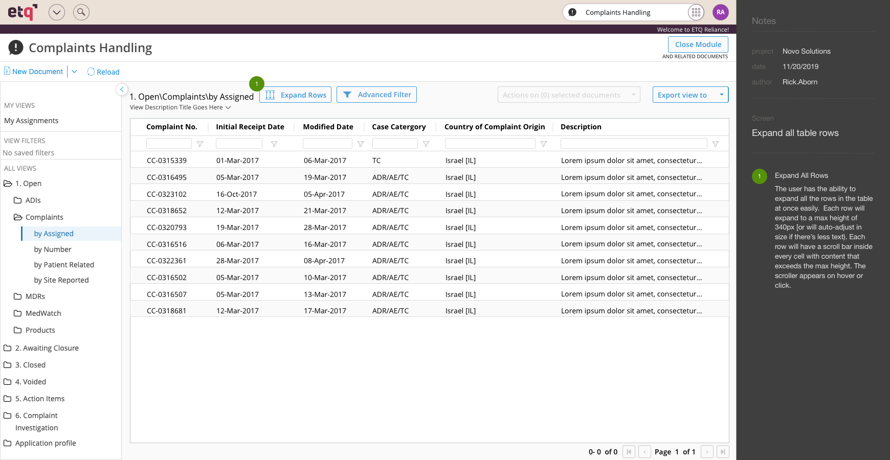
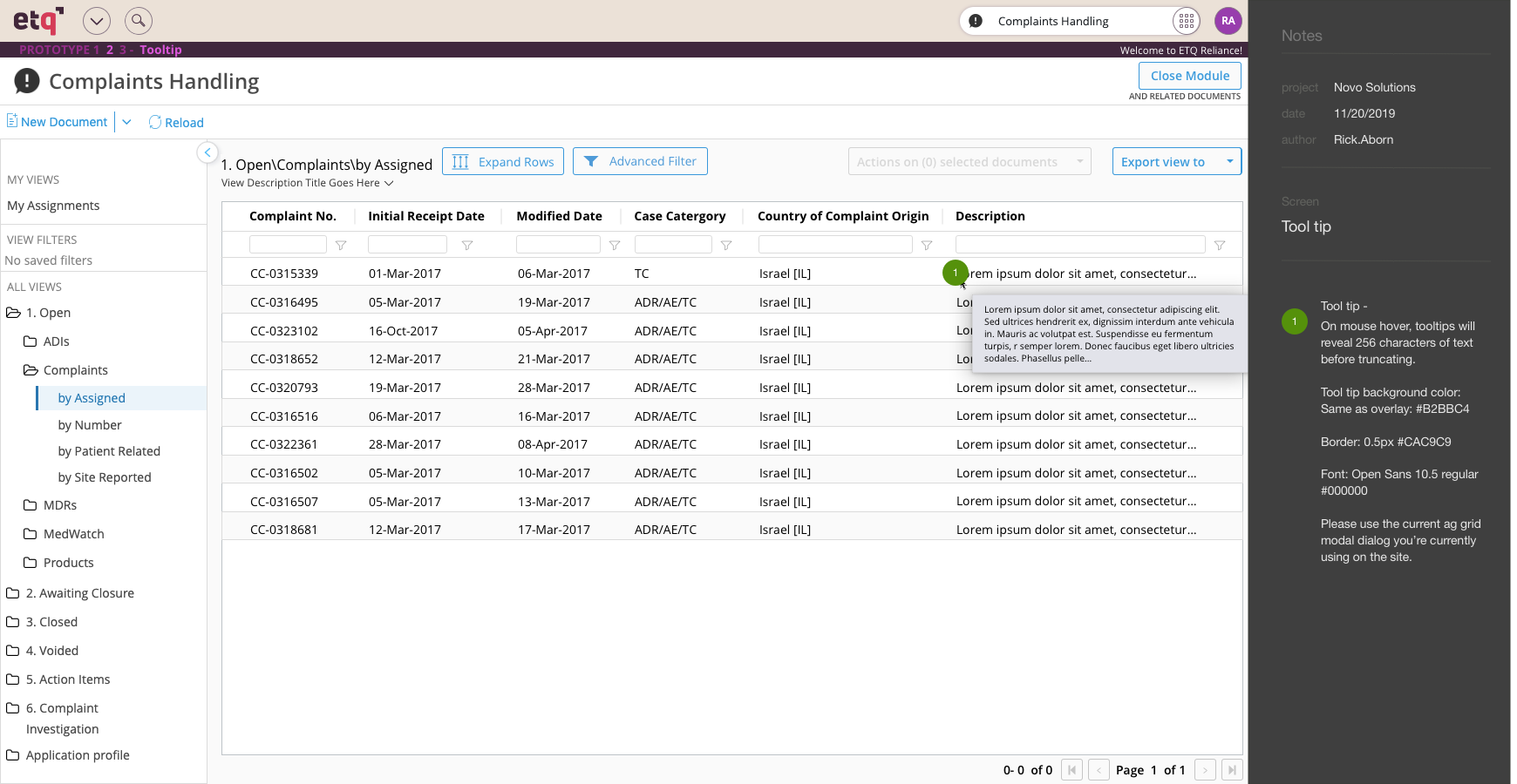
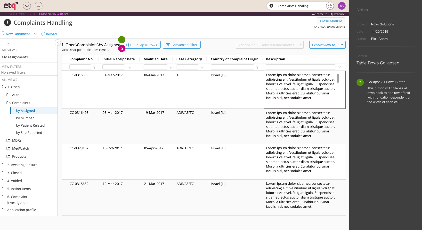
In the final design handoff, a tooltip would reveal 256 characters of text before another truncation ends with ellipses. Any text exceeding 256 characters could be viewed by clicking into the cell with a scroll bar appearing to reveal more content. Furthermore, if multiple cells have a surplus of content then the user can expand all rows to a max height of 340 pixels. This design change will allow users to scan their content far more efficiently while maintaining a fuller view of the entire table.
Below is a quick video showing my two prototypes from the A/B test merged into one. Below you’ll see a video of how the tooltips and expand rows button work together to make the table easier to scan. This solution keeps the user from manually adjusting every row/column and eliminates them from needing to click into every link for more information. The user has more tools at their disposal to get the information they need more efficiently and with less hassle. Every small improvement makes a big difference for the user and adds to the competitive advantage. If your product is much easier to use, then it will be preferred and outsell your competitors.
Video of text wrapping solution
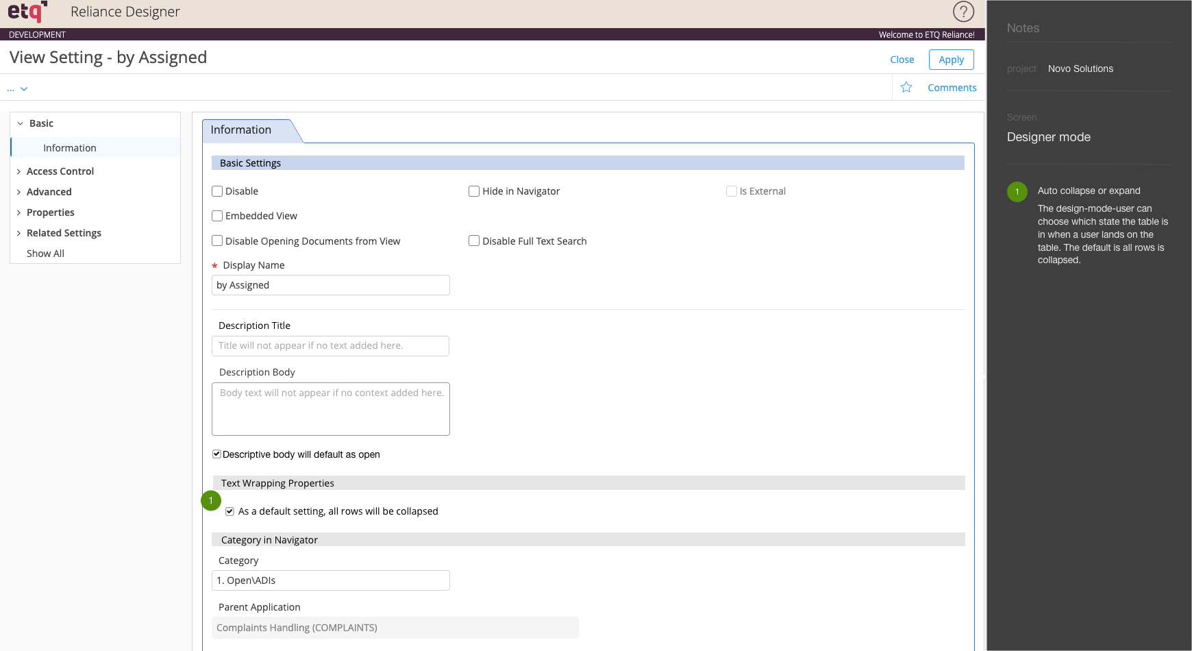
Below you’ll find some of my final handoff pages for our dev team. You’ll see my instructions for design layout and functionality in the gray column on the right-side of the screen shots below.
Text wrapping solution handoff – aka Dev team’s instructions
Reflection
I believe this design will go a long way towards improving the experience for Reliance users. This improvement was being added at the very end of my contract and I would love to find out what our customers think. It would be great to get more feedback and make more iterations.
Another feature that was designed, tested and sent to the dev team at the same time was the addition of a reference guide. This was a customer feature request which I’ll explain in the section below.
2) Reference guide – customer feature request
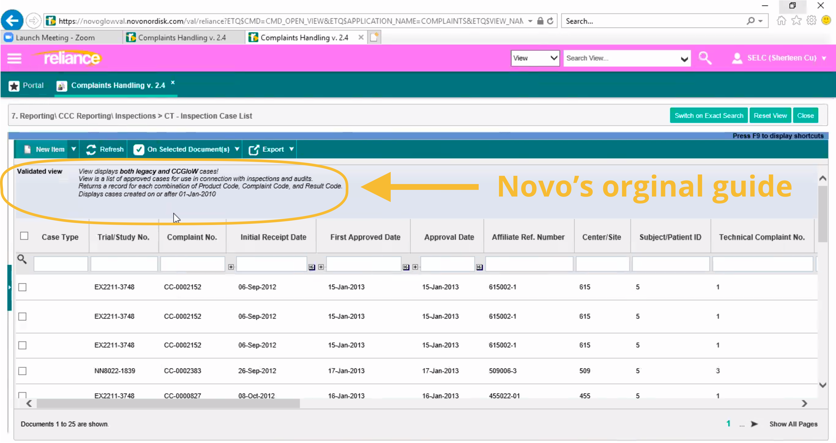
One of ETQ’s most influential customers, Novo, asked ETQ to add a feature to their latest version of the software, Reliance 2019. In an older version of Reliance, Novo had manually coded a reference guide for their own employees into their documents. It was designed to assist their employees with the various documents they used daily.
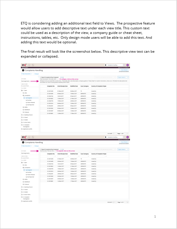
The older version of Reliance with a manually coded reference guide:
After an ideation phase with our VP of product, we came up with two possible solutions with time, cost and usefulness of this feature as obstacles to this project.
Possible solutions:
1. Add a hyperlink under the title so users can open up their own window and add/code their own reference guide in this new window. Our CTO was in favor of this option because he wasn’t sure how many other companies would use this feature and was looking to save time and money.
Pros: Easy to code on our end, lost-cost
Cons: Users wouldn’t be able to maximize Reliance as this reference guide on the same monitor rendering this a less-than-ideal solution.
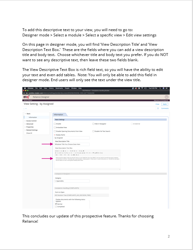
2. Add a rich text field under the title
Pros: Works just like Novo coded in their own system and would be more useful for other companies. No need to have two separate windows open.
Cons: More expensive and more time to develop.
Proposal sent to Novo:
Ideally I would have sent out a survey or questioned more users to see if they would use this feature before implementation, but time was a limited resource. So I set out to design a proposal of solution number two for this feature. After a group video conference with Novo, I sent the prospective feature design to them.
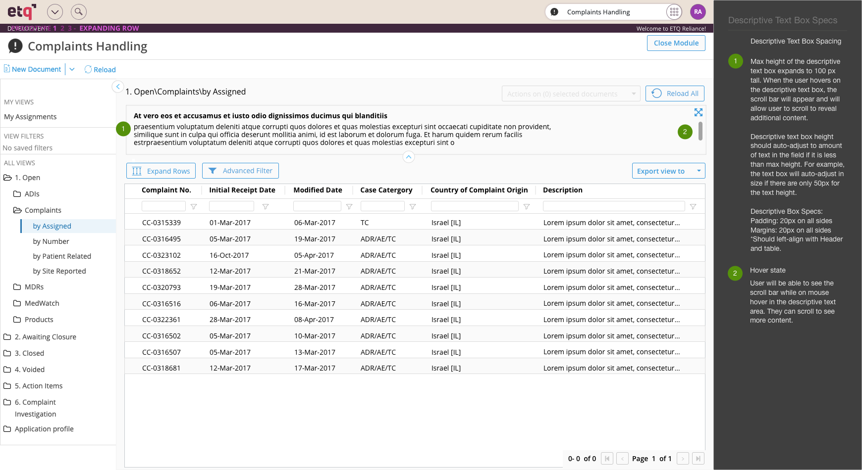
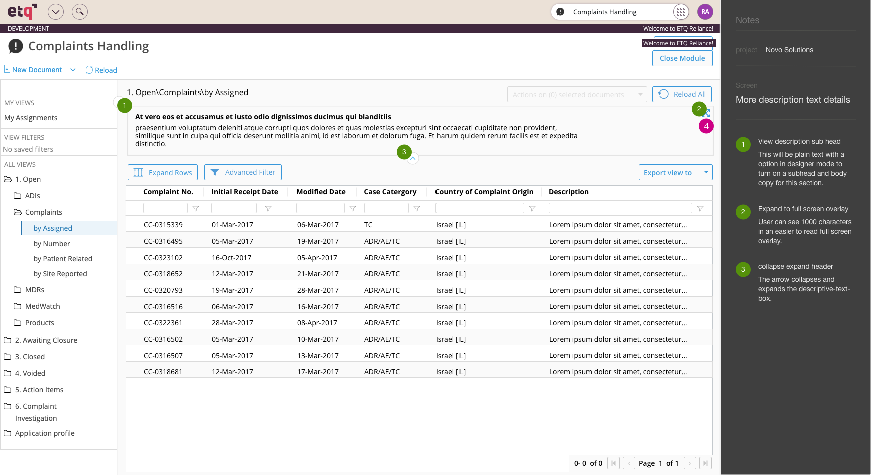
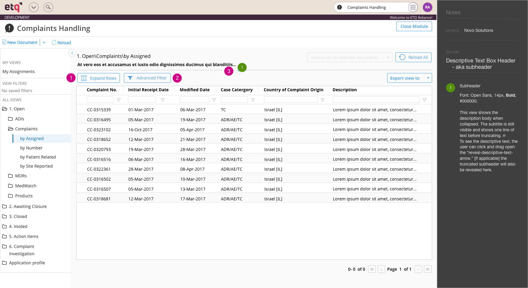
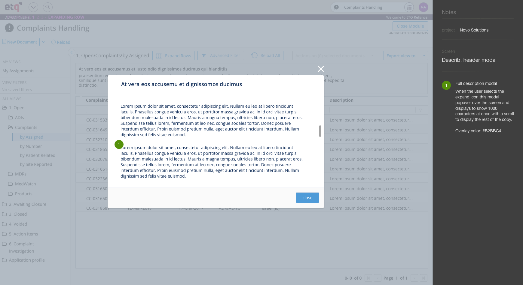
Novo was very high on the designs that I created and were excited to get this feature installed. This new feature would include a subhead to describe what the following text was for and then included any instructions, references, etc. a company wants to include here. The user could reveal or hide this guide by dragging the center arrow at the base of this element. If a company doesn’t want to use this feature then they can easily disable it in settings mode or leave these text fields blank.
Below you’ll find my final design handoff to my dev team.
Reference guide – final design handoff – four pages:
Reflection
The reference guide was being added at the end of my contract with ETQ. I would love to see how customers utilize this feature and what they think of it. There are other potential uses for it like instructions, comments, etc.
3) Other projects
Below you’ll find some other examples of work I completed for ETQ.
Site map

I conducted a site wide audit of the different elements that ETQ uses. Below is just one example of a button audit I conducted.
Button audit

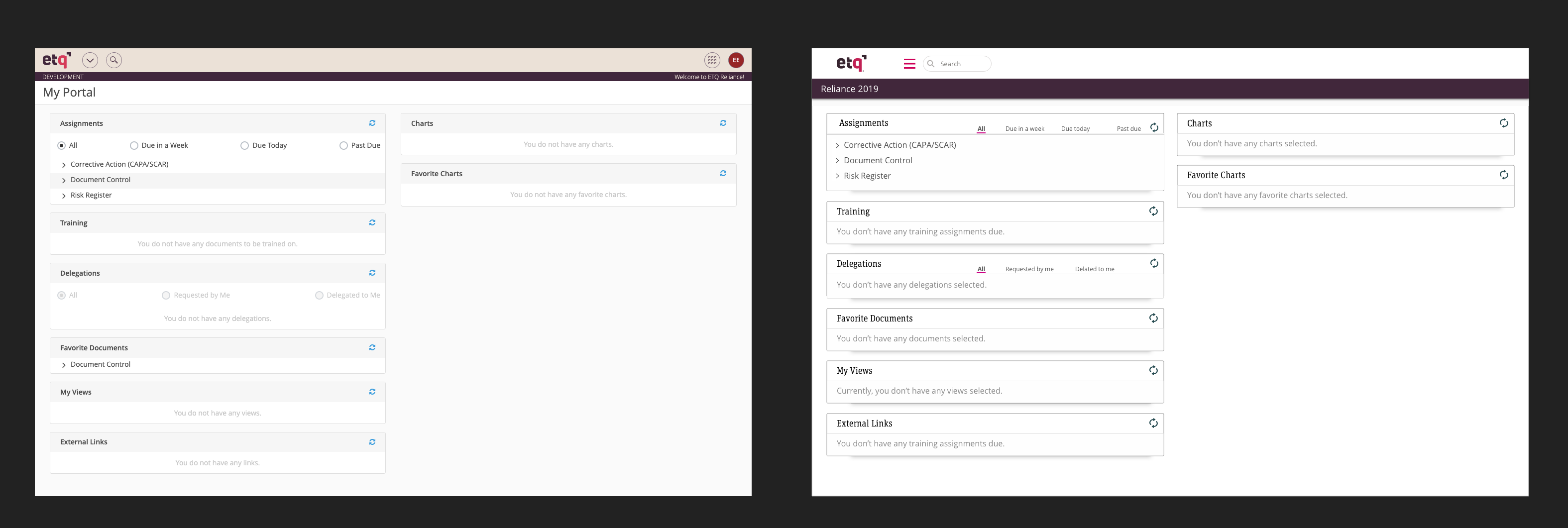
Created a re-skin design of the My Portal home page using the new style guide. The new style guide was created by our Senior Designer.
Original my portal Redesigned my portal
Reflection
Overall, I grew a ton as a designer at ETQ. If you found this case study interesting then check out my case study on creating a new onboarding process for ETQ below.
Back to top
