
Dynamik Sports

Briefing
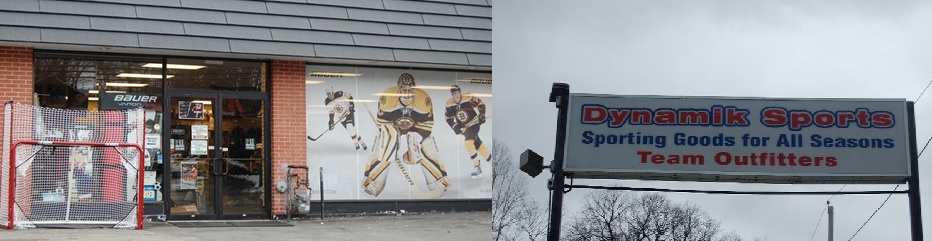
Dynamik Sports is a sporting goods store located in Reading, MA. They specialize in hockey goods but also offer baseball, lacrosse and soccer products. They currently have a website but it lacks an e-commerce functionality. So I created this conceptual mockup which focuses on providing users with the info they care about most when purchasing sporting goods online. Making the information architecture intuitive was another a key factor to my process.
Discovery stage and a trip to the store.
In order to design a digital prototype to illustrate a successful online shopping experience, I needed to dig deep and grasp the needs of the business and its users. I started by making a trip to the store to gather information. I also collected an inventory of items the store carries and performed a competitor analysis.
Competitive analysis for ecommerce sporting goods (with a focus on hockey)
One of the first steps of my process is to check out what the other guys are doing. Doing a competitive analysis is fun and exciting in my opinion, haha. It acts as a mood board and allows me to get into the mindsets of other designers in this space. I feel I can get a sense of what they were trying to achieve based on their design decisions. I also generate an overwhelming amount of ideas by seeing brilliant concepts that work really well, concepts that miss the mark, and hopefully net new ideas that no one else is doing. This would allow for differentiation and perhaps a competitive advantage.
Beyond the brands listed below I’ll also sneak some peaks at different industries that I feel also resonate with my design. For example I checked out edgy brands that are geared towards teenagers like Mountain Dew, RedBull, Billabong, Tony Hawk’s site, Xbox, Playstation, etc.
And during this process I’m also focused on the functionality of various components like navigation, categorization, filter and sorting options, how testimonials are displayed, how much product info is served up, h0w their mobile site condenses tells me what they prioritize and lastly what their checkout is like.
Below you’ll see my grading system for various aspects of other sporting goods stores websites:
")
User interviews, feedback and findings
After getting a better understanding for the sporting goods industry and how companies design for similar target users I felt that was fully informed on the current landscape. At this point in the process I typically feel I have an decent understanding of what types of questions and follow up questions I want to ask actual customers.
I created an online survey that doubled as a screener to pick out specific target users. Two qualifications were 1. people needed to play a sport and 2. needed to have already purchased equipment atleast once online.
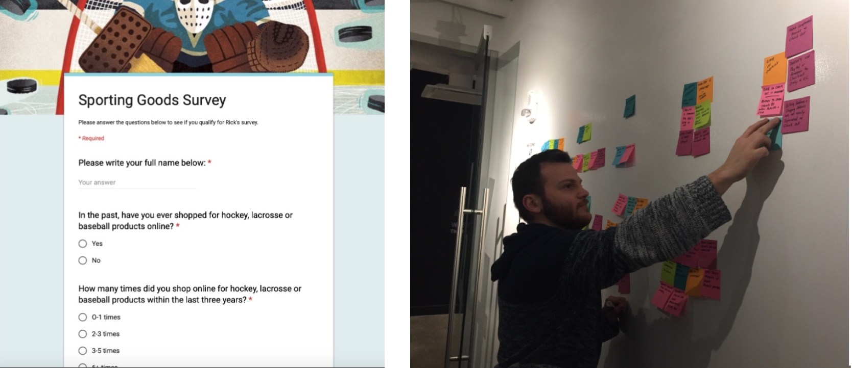
Some key quotes from my seven interviewees:
“Although I can’t try things on in the store, I do enjoy the process of shopping online since my time is limited and buying online is so quick and easy. That said, I’d ideally want a free return process if I don’t end up liking it. That would make me much more comfortable and much more likely to place an order.”
“Most important aspect to shopping online is the product info, product reviews, why reviews are presented because I get the sense that visiting national brands that the reviews are curated. I’d also love to see customer reviews that include the persons measurements and a picture of that reviewer wearing the equipment so I’d get a better sense of if it will me right. I’d be more likely to buy with robust product reviews from actual people.”
“Had a negative experience with Amazon, I don’t like how the buy now button is too close to other options. I hit it by accident, then I had to cancel the order which was way more steps than I wanted to take.”
“Buying clothes online has always been a bit of a gamble for me. It seems like no matter how carefully I measure or read the size charts, the fit never quite matches up to what I expect. It’s frustrating to have to deal with returns and exchanges, especially when you’re excited about actually using the thing your getting. When I am buying things online I feel way better if it’s a repeat purchase of something I’ve already used or very similar. Having the option to return items in person at a brick-and-mortar store definitely makes it easier to buy online.”
ALL OF MY INTERVIEWEES HATED THE IDEA OF BUYING EQUIPMENT ONLINE! INITIALLY THIS FEEDBACK FELT LIKE I WAS RUNNING INTO A BRICK WALL AND ALL MY DESIGN EFFORTS WOULD BE FUTILE.
But you know what they say: “Walls were made to be broken.” Right?! Anyways, my interviewees did give me great feedback and ideas for reducing their reluctance to purchasing equipment online…
Users felt much more comfortable purchasing equipment online if:
- They already purchased the equipment before and were getting a replacement.
- Were getting something with exact dimensions like a hockey stick or net
- If they saw a review and photo of someone who was their same body dimensions like height and weight using the product.
- If there was a great return and refund policy.

Design audit findings for the current site
Next on my list for discovery was to conduct a design audit for the current site to fully generate what my problem, hypothesis and design goals would be.
- The current logo is low-budget and outdated.
- The current site lacks functionality and is mostly a digital brochure.
- There is no way to digitally order equipment.
- The photos on the site were taken by the owner in the early 2000s.
- One unique aspect of the site is an elusive login for specific sports teams that can view discounted pricing for uniforms, bags, etc. I love this part of the site. It also showcases those specific teams and likely promotes loyalty from those teams.
- The color scheme is the same as the Reading HS and community sports teams which does likely establish more loyalty for the local town’s customers. However I grew up the next town over and felt like I was shopping in enemy territory when I came here. So there are certainly pros and cons with this approach.
")

Problem statement
“Athletes and their parents encounter significant hesitation when purchasing sports equipment online, primarily due to the lack of tangible fitting options and uncertainty about product suitability. This lack of confidence can hinder their decision-making process, leading to missed opportunities for online purchases.”
Hypothesis
“We hypothesize that by developing a comprehensive e-commerce platform that features:
1. Detailed customer reviews, including the reviewer’s body measurements for personalized insights,
2. In-depth product specifications and usage information, and
3. A hassle-free return policy, we can significantly enhance consumer confidence and facilitate online purchases of sports equipment.
We will consider this hypothesis validated when we achieve a 20% increase in conversion rates, a CSAT score of 85% or higher, and a reduction in return rates by 10-15% within the first six months of implementation.”

Brand Identity Brainstorm via WordWeb
At this point, I took a cue from MadeByJames, a popular graphic designer I follow, by creating a WordWeb to ideate what type of brand I was going to build for Dynamik Sports. This really does get the creative juices going and help ideate how to build your company’s branding. Some words I wanted to truly emphasize as a brand were: Friendly, Vibrant, Community, Lightning, Blueprint, Passion, Life Style and Persistence.

My insights and goals for the redesign
1. Introduce a new vibrant and ‘dynamik’ color scheme that reflects the energy and excitement associated with athleticism and youthfulness. Changing up the color scheme will also emphasize the store’s commitment to serving the entire community, and reduce any notion of exclusively serving to Reading High School students.
2. Introduce a new logo that resonates with both young athletes and their parents.
3. Incorporate high-quality, professionally taken photos showcasing the products available in the store, as well as action shots of athletes using or wearing them. This will add visual appeal and help customers envision themselves using the products.
4. Implement modern design elements and interactive features to enhance the overall user experience and create a sense of excitement.
5. Highlight the benefits of the products, such as performance enhancements, comfort, durability, and affordability.
6. Expand upon the existing login feature that includes personalized discounts and promotions for various sports teams or groups. This will incentivize customers to create accounts and foster a sense of loyalty among different communities. Featuring and supporting these teams will expand upon that message.
7. Add a user-friendly navigation and make it easy for visitors to find what they’re looking for. This includes organize products into logical categories and providing intuitive search functionality to facilitate quick and hassle-free browsing.
8. Introduce interactive elements like product views from all angles, size guides, informative charts and videos of experts talking about the features and benefits of each product. The goal is to enhance the shopping experience and provide valuable information that will shopper more comfortable making an online purchase without trying the equipment on in person.
9. Incorporate robust social proof by showcasing testimonials from satisfied customers and endorsements from local sports teams or influencers. This will also help build credibility and encourage visitors to make purchases.

Next, I used card sorting techniques to optimize the information architecture.
I wanted to make it easy for users to find product on the site without using the search bar. Sometimes users don’t know exactly what they’re looking for so categorization is important. Let’s say a user wants to search for tools to help them train, they can find these products easier by going to the proper hierarchy of categories. To determine optimal organization, I went to the best resource available: the users themselves. I utilized two different card sorting methods for this process. My process is explained more below:

Open card sorts
To determine how to group the different store items, I started with an open card sort. After six different tests I found:
- There were two different groups of like-minded people. Half of my users created 25 categories while the other half created seven categories
- To reduce this polarization among users, I decided to conduct some closed card sorts with categories selected from both groups.
Closed card sorts
To create my categories for the closed card sort, I:
- Reviewed my results from the original six sorts
- Conducted the open card sort myself to better understand the process. Realized one group was very broad while the other group was very specific. I decided to use 16 categories as a middle-ground.
- For closed card sorts, I had three participants. My categories made sense to my users based on strong correlations in my data.
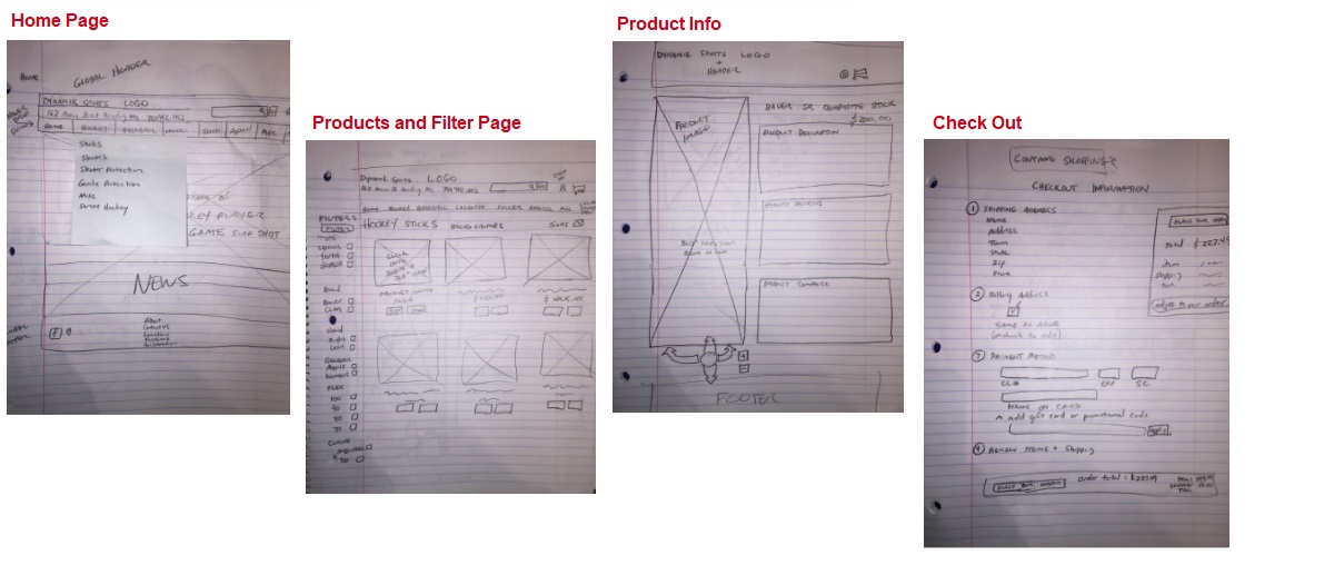
Site Map
Now that my products were well categorized it was time to build a site map which I feel builds out user flows all by itself (for the most part).

Now that the research phase is complete, it is time to start designing wires.
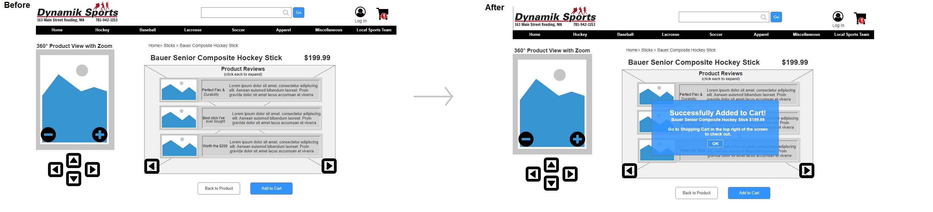
Feedback from usability testing and my iterations
Feedback: One user was not sure when a product was or wasn’t added to the shopping cart. There was a red circle that popped up over the shopping cart, however they did not notice this change.
Solution: A transparent box that says item was added to the shopping cart after she clicked on add to shopping cart. It gives instructions on how to get to cart as well. Can click out by pressing okay.
Solution: I changed the product review page to show three different reviews at once. If a user wants to see detail about the review then they can click on specific reviews to see more.
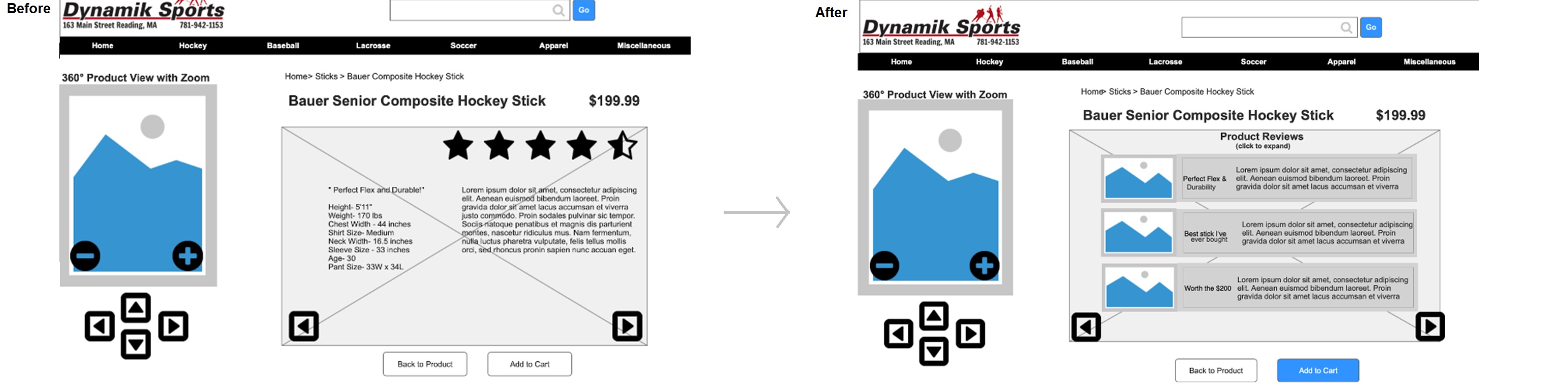
Feedback: My users thought the checkout screen was confusing because everything on the page was packed in. Ultimately there was not enough white-space and users felt confined.
Solution: This was problem was solved by adding more white space between everything on the page.
Creating a design system and style guide to maintain consistency
It’s a lot of work to create a design system but ultimately saves a ton of time by making it easier to design for larger scale projects, easier to maintain consistency and lastly easily make system wide updates.
")
")

Final UI line up:
It’s difficult to quickly show these screens off in a larger format, but hopefully you can zoom in further to see the details. There’s also a link to the prototype and a larger version of the homepage below.

Prototype link:
Feel free to check out the prototype below. If that doesn’t work for some reason I included my homepage below.
")
Reflection and potential next steps
This was an extremely fun project to further develop my skills as a UX/UI designer (turned storyteller for my case studies). I hope you enjoyed learning about both my design and thought processes.
For potential next steps I could:
- Transitioning this to fit on a mobile screen would be a fun project.
- Designing similar flows for other sports like baseball, lacrosse, and soccer.
- Building out the product customization flow would be interesting and something I have not designed yet…
- Creating a handoff guide for DEV would be something I haven’t shown in my case studies yet.
Feel free to see more of my work with the link below or feel free to reach out to me for an interview!
Cheers!
Rick.aborn@gmail.com
781.5809327
Back to top