
ETQ
ETQ (Excellence Through Quality) is a leader in the quality management software industry. Their software named “Reliance”, helps large companies with complex operations run more smoothly and efficiently. Their software is highly configurable which allows companies to tailor ETQ’s software to fit their needs. When I first got to ETQ, my goal was to analyze usability tests of their latest software, organize the data and provide recommendations for solutions. From there, we created a plan to make UX and UI changes for later deployments of the software.

1) Usability test analyses
One other designer and I analyzed nine usability tests from two different companies. The first company we analyzed was very new to using ETQ’s Reliance software while the second company had been using the software for roughly six months.
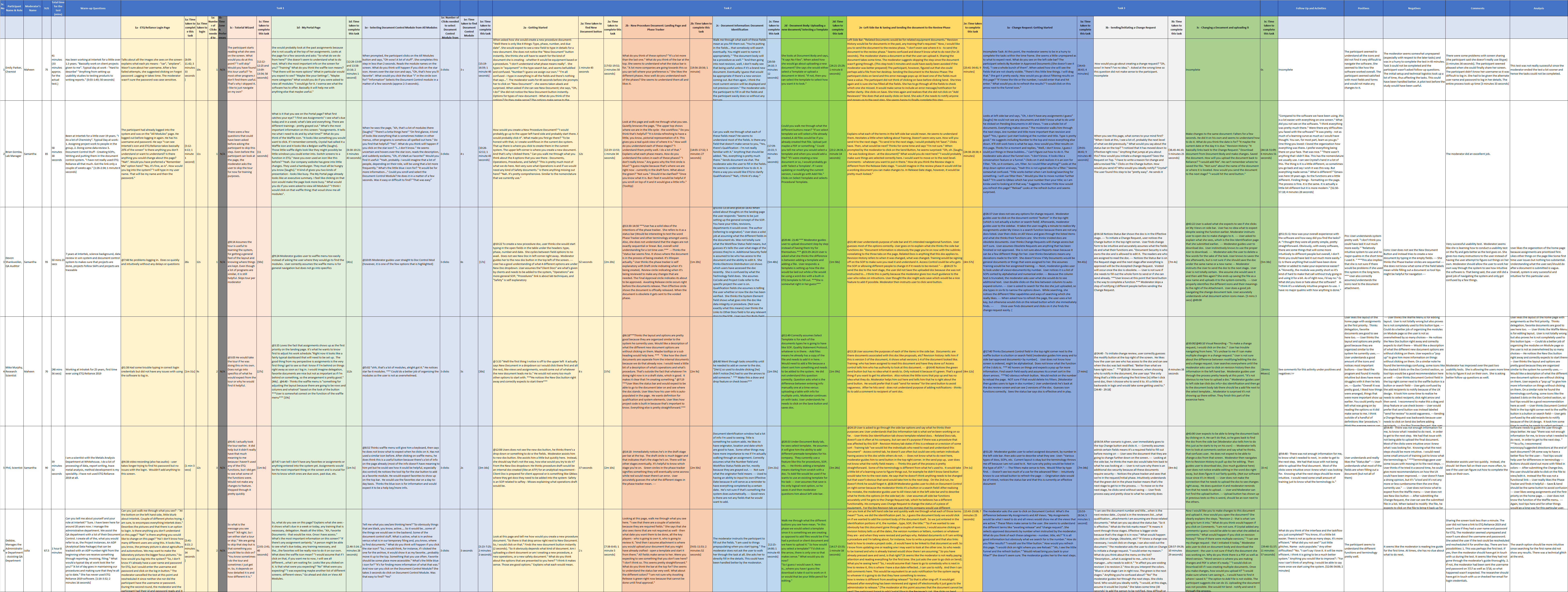
We organized our findings for the first study by user, each separate task, time to complete each task and then by usability issues and usability successes for each test as you can see below:
From there, we discovered many patterns and usability issues, like:
- System generate emails were not user-friendly in terms of wording and did list the titles of the documents.
- Users wanted a back button
- There were some contrast issues for some fields
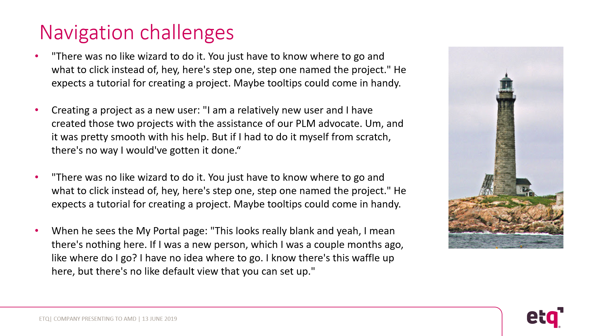
BUT the most common pattern we discovered was many new users struggled with navigation.
Several users could not determine how to find different modules or create a new document. We knew that the software needed a redesign and also better tutorial to train new users. The words from the users themselves via a slide from my presentation:
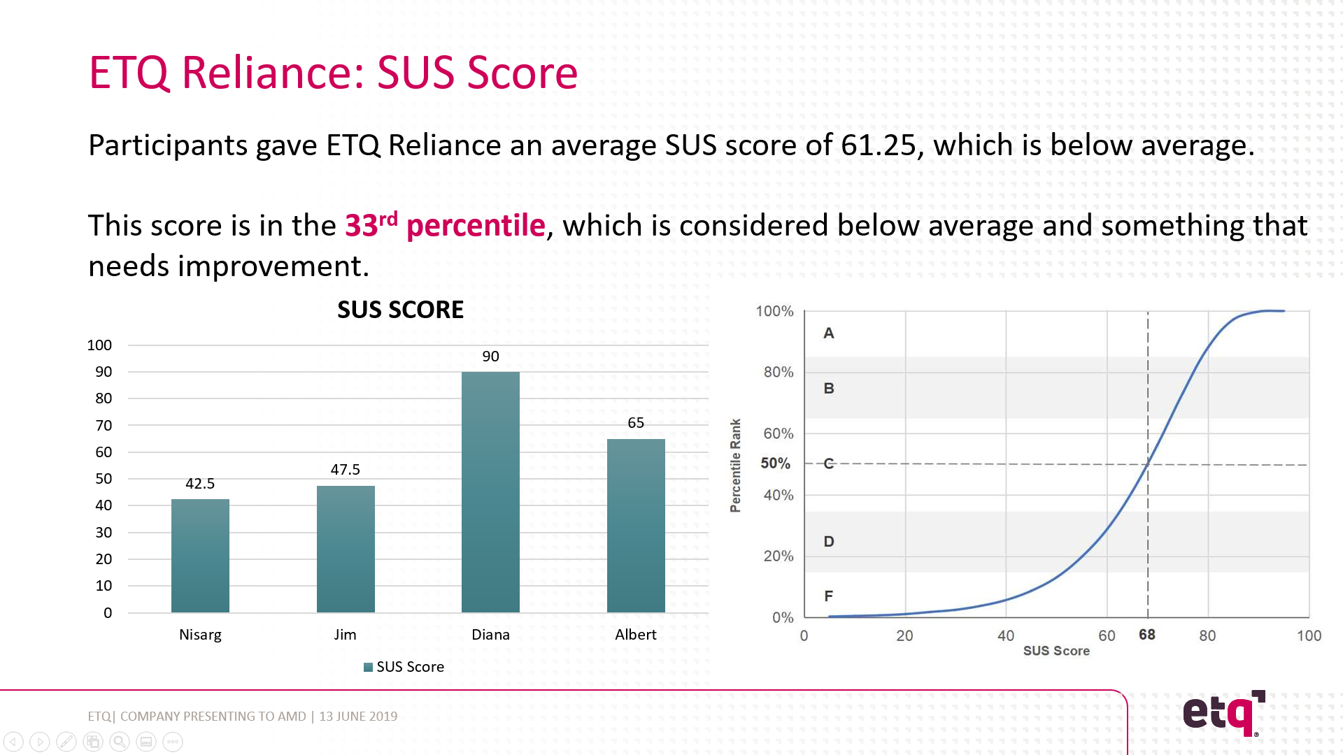
We found that users thought our software could improve and be easier to use. Below you’ll find the SUS score (how the users rated the usability of our software) from one of the usability analysis presentations:
I knew that the current training was not sufficient and my first goal was to make it easier for new users to learn and navigate our software which you’ll learn about in my next mini-case study.
2) Improving the onboarding process
Focused tutorial + Informative tooltips = Better onboarding experience
To remedy this problem for new users, I set out to create a better onboarding process. I found that the original tutorial opened in a separate tab and did not show the user how to complete tasks. Instead of guiding the user step-by-step through the process, it just labeled several elements in the software and defined their function. Because if this, users needed to piece together how everything worked on their own (which took more time).
From my experience and research, I find that users learn and retain information better when they learn by doing. With this method, users find roadblocks and once they do, they’re taught how to navigate around them. It has been clinically proven that people who are slightly stressed actually learn more efficiently. So, my goal was to have the user complete a task using the software. While they were completing this task, the user would be provided with information that focused on common new user pain points.
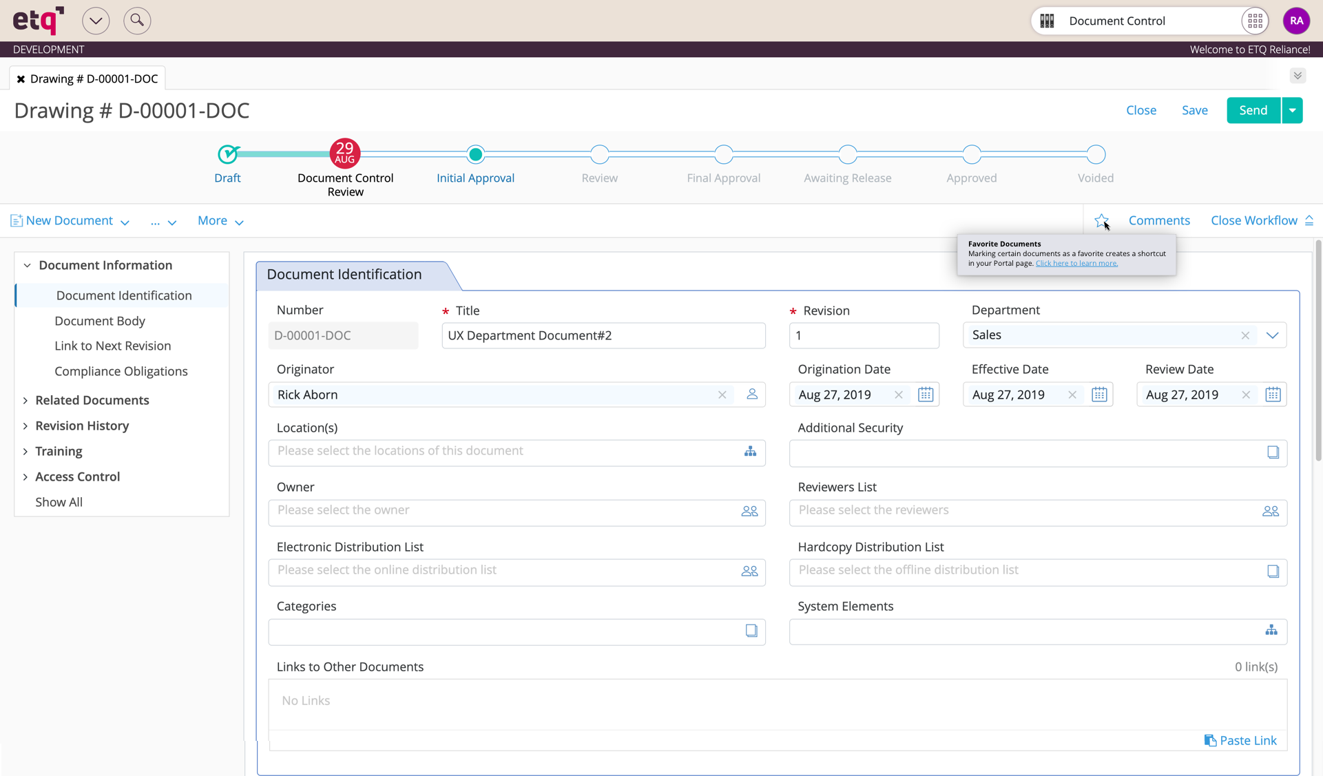
To avoid an overload of information, I only wanted the user to learn about common pain points in the tutorial. The user could learn more about unmentioned elements using tooltips. The user could hover over any element on the screen and a helpful hint would teach them about that element. This eliminated many steps that I originally considered teaching new users. You can see an example of these tooltips below in a screenshot and video:
Informative tooltip examples:
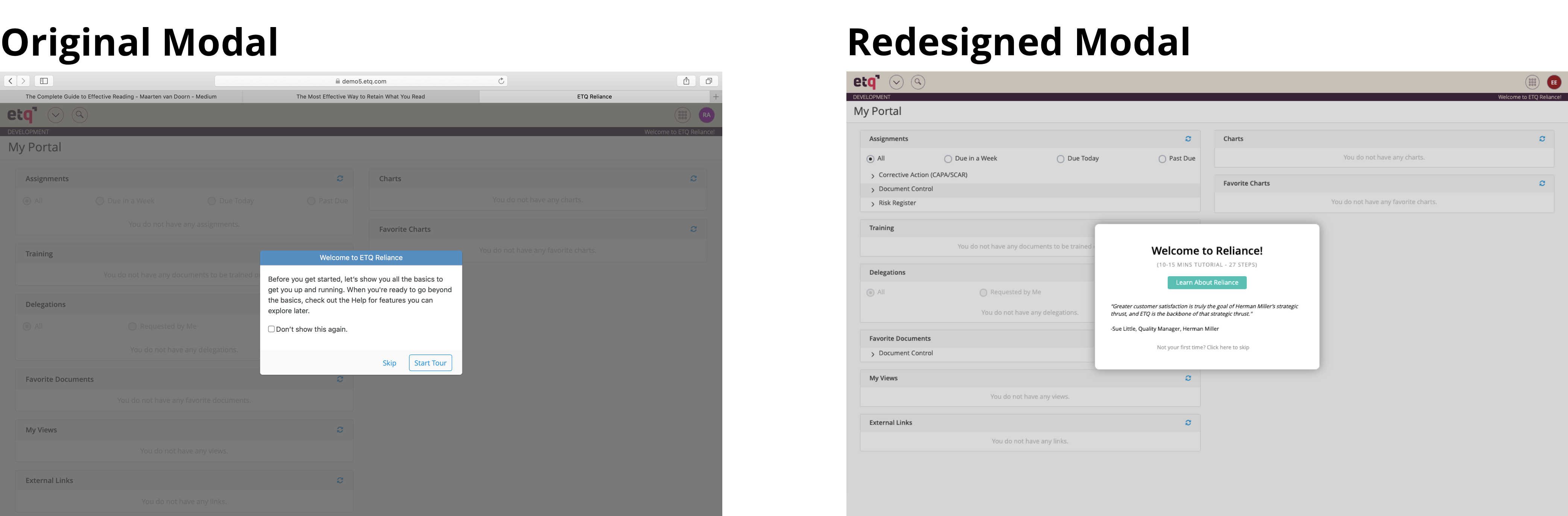
This redesign also included adding small touches to improve the tutorial. For example, I added an executive’s quote to promote the usefulness of the Reliance software. That quote:
“Greater customer satisfaction is truly the goal of Herman Miller’s strategic thrust, and ETQ is the backbone of that strategic thrust.”
-Sue Little, Quality Manager, Herman Miller
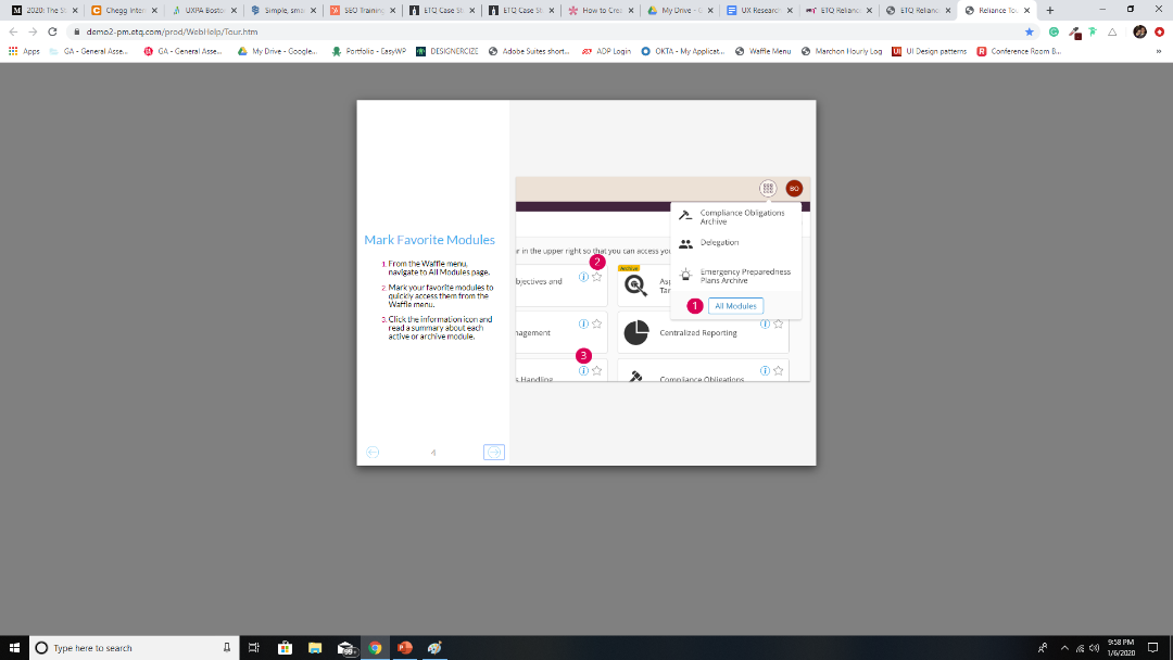
Below is an example of one of the navigational pain points for new users. Users overlooked this step in the original tutorial and did not know how to find the all modules screen. This is done through the waffle menu which the tutorial reveal with a looping video. (Still working on making this auto-loop in my portfolio).
Original tutorial step
Redesigned tutorial step
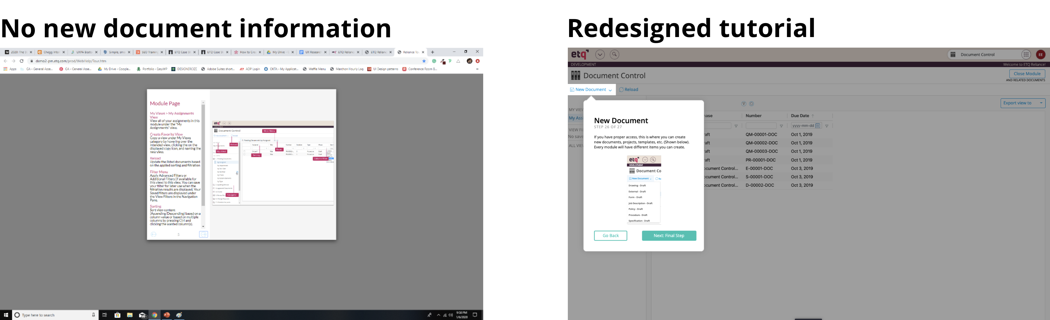
And the last example I’ll mention here is: the original tutorial did not show users how to create new documents or even mention the new document button. Despite the new document button having a prime location in the top left of the screen, the majority of users overlooked this button. Despite the location the button fails to stand out because it’s 1) a ghost button and not filled in with a color. And 2) there’s plenty of other distracting options on the screen. Somehow, this all-important button gets lost in the void. In the new tutorial, I reveal what this important button can do.
Reflection
This was a project that saw real promise early on with my successful results from usability testing, however my contract ended before this got implemented. I would love to see how this new onboarding process would do in an actual implementation. I believe this process would significantly decrease customer service issues and increase customer satisfaction.
Back to top