CDC Travwell app redesign
Personas
Problem statement
Testing & iterations
Business Analysis
Problem statement
Prototype

Overview
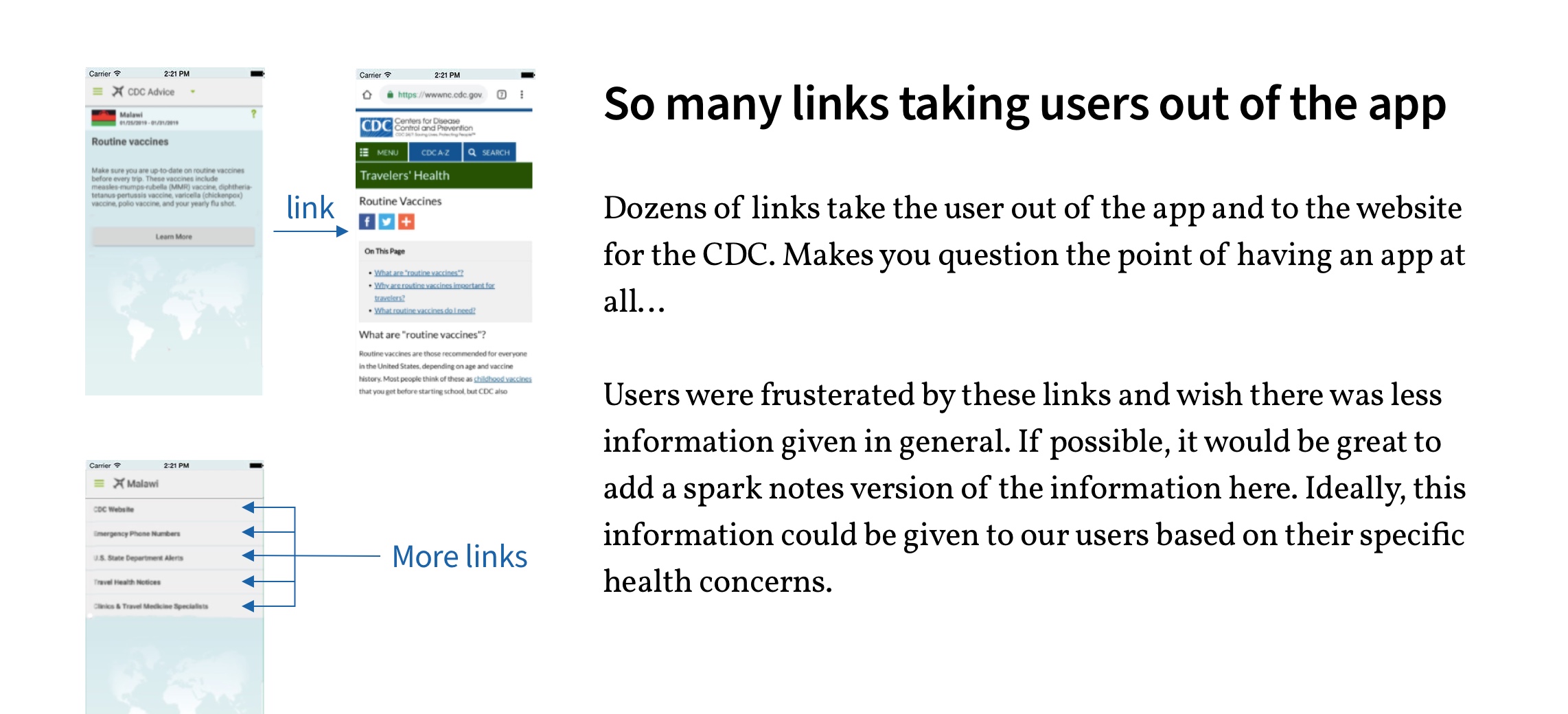
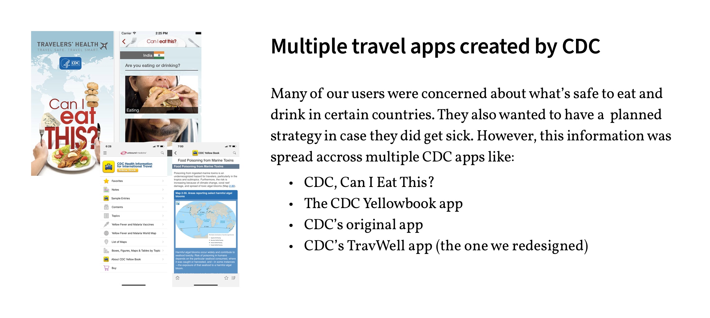
The CDC TravWell app provides travelers with vital safety information for their upcoming trips. However, many users find the current app to be cumbersome with an overwhelming amount of content. And there are several apps created by the CDC that travelers should download. But what if this information could be delivered to travelers in one, convenient and powerful app?

Working with a new UX team and setting up ground rules:
To start, our group discussed our strengths, weaknesses and preferences to formulate a team plan and schedule. We decided we would work on certain tasks together and others separately. We also discussed strategies for decision making, conflict resolution and communication. We wanted to be as efficient as possible to stay within our scope of the project and to assure a quality product.
The CDC TravWell app helps travelers plan for safe and healthy international travel. The app provides:
- Destination-specific vaccine and medicine recommendations
- Checklist of preparations including a packing list
- Ability to store travel documents and records
- Set reminders
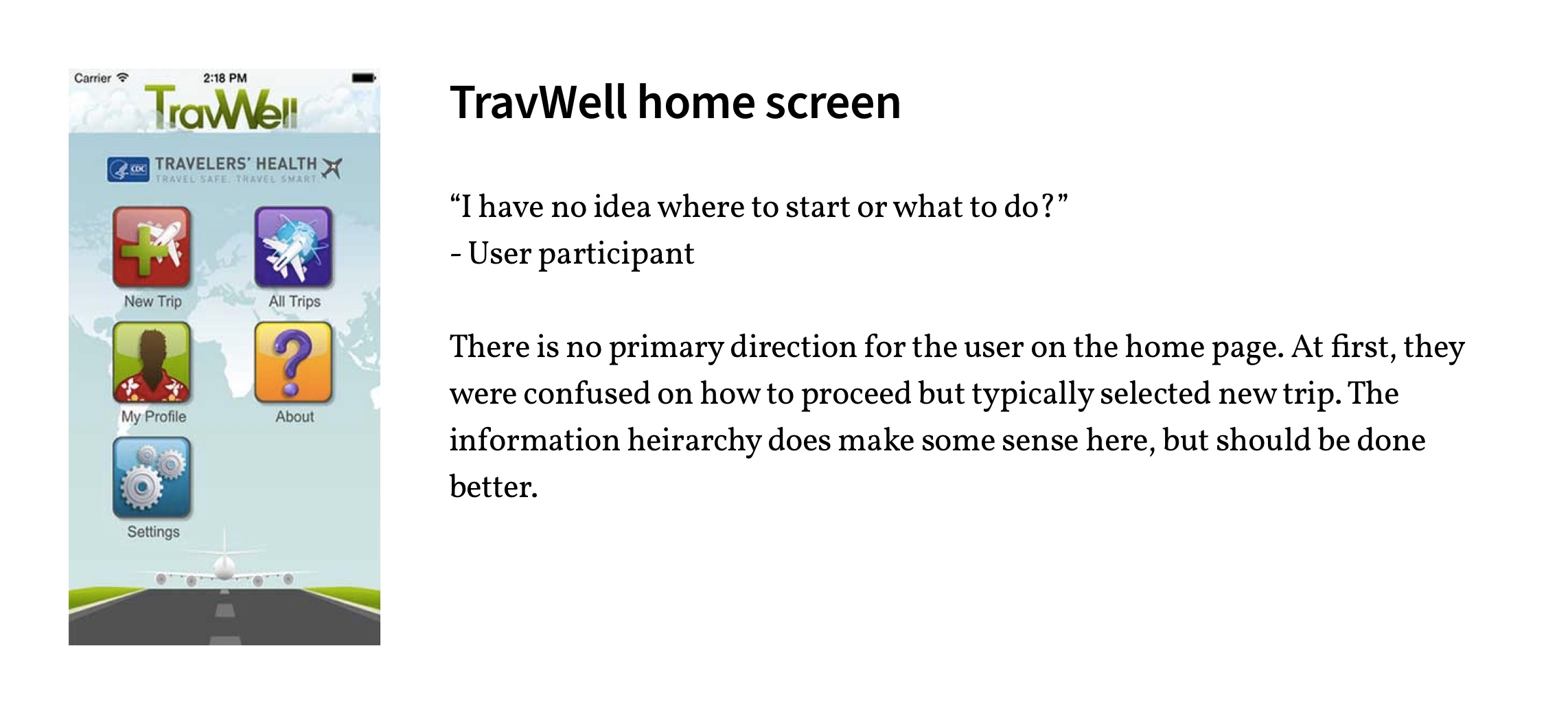
Evaluating the current CDC TravWell app:
To start off the process we reviewed the current TravWell app and conducted usability studies with five users. This gave some insight into what users liked about the app and what their immediate pain points were. See the slide show below for more info:

Some adversity along the way… What else is new?
- There is an immense amount of data online and within these various applications. There is a need to determine what to add and what to cut.
- Both of my partners lost their access to Sketch, so I needed to mock up our prototype from mid-fidelity to high-fidelity.
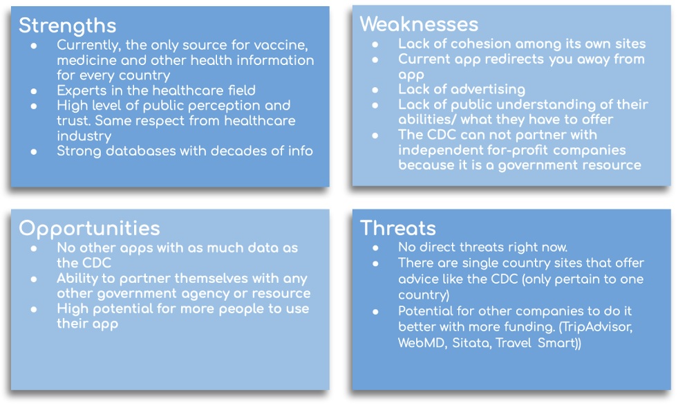
Business analysis
I created the business analysis by using a SWOT chart. SWOT charts summarize the Strengths, Weaknesses and Threats to an organization to fully understand their position compared to similar organizations. From our user interviews and from my internet research we found our key takeaways:
- Currently no major competitors that challenge the CDC
- Plenty of potential for competitors
- CDC is well respected and has enormous amounts of data
- Room for growth
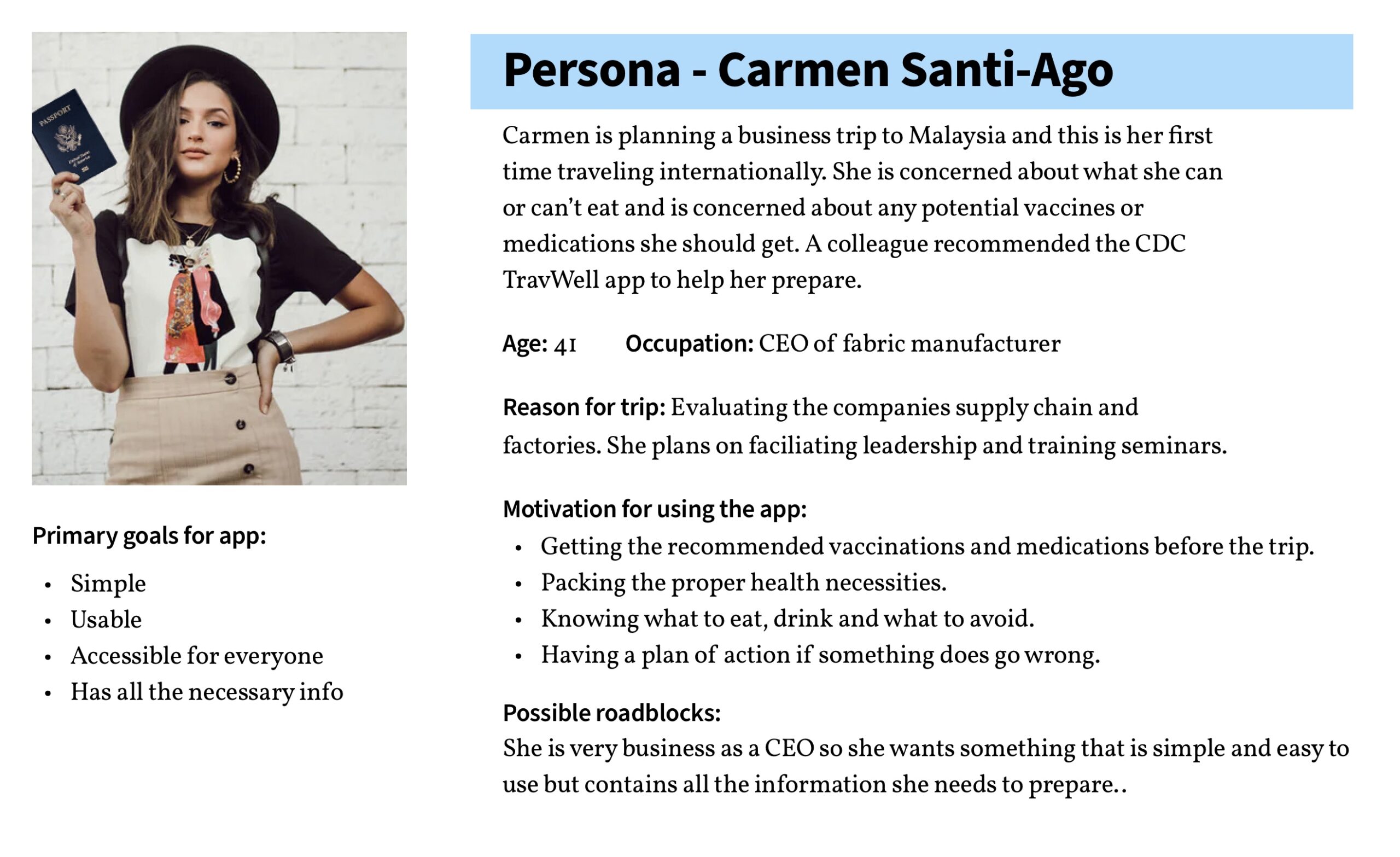
Creating the Persona
To take a closer look into our user’s attitude and motivations for using the app we created a persona. This helped us keep focus on the needs of our user’s and how we needed to meet them with the application.
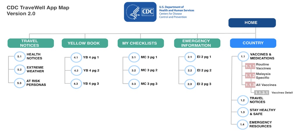
Creating an app map
We built an app map to give us overall clarity on how to build our information architecture for our application. This map was “evergreen” and updated throughout the project to keep us on the same page with our layout.
User interviews
We interviewed several different international travelers about their process in determining their health risks while traveling. We inquired about what they wanted to know and how they typically accessed that information.
About the original app: “A lot of this stuff I have absolutely no reason to be concerned about.”
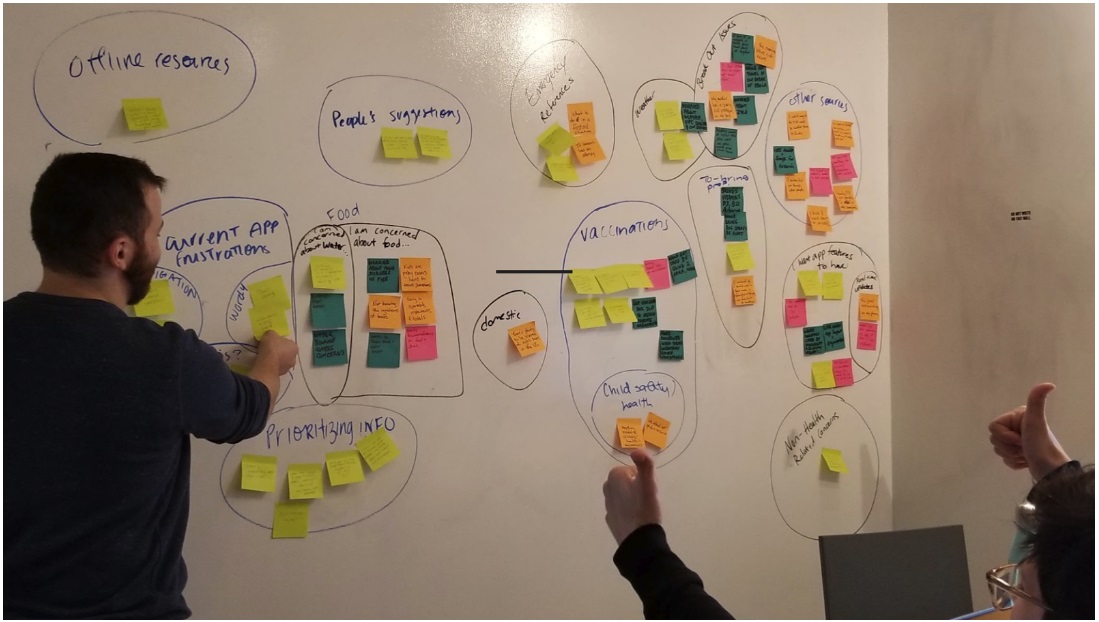
Data synthesis
We used an affinity map to synthesize our data. We found that our users:
-
Want information readily and specific to their needs
-
find the current app doesn’t curate resources & content effectively
-
are concerned about seafood, ingredients, staying hydrated and water borne illness.
-
want to know what types of new issues there are in their destination country like Zika, Ebola, etc.
-
are concerned with unsanitary living conditions and how to protect themselves.
-
want to know what to bring for weather, first aid, allergies, fainting, general safety and wanted like a checklist to prepare.
-
want offline resources in case they did not have the internet or had a slow connection
Our problem statement
The CDC needs a way to make its TravWell app simpler and more accessible because its current IA is difficult to navigate.
And the solution statement
We believe that by streamlining and simplifying the Travwell and CDC content, we will make this app more accessible and easier to navigate.
We will know this to be true when we see the usage of the TravWell app increase by 10%.
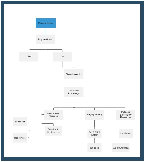
User flow:
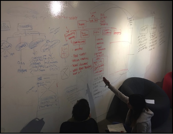
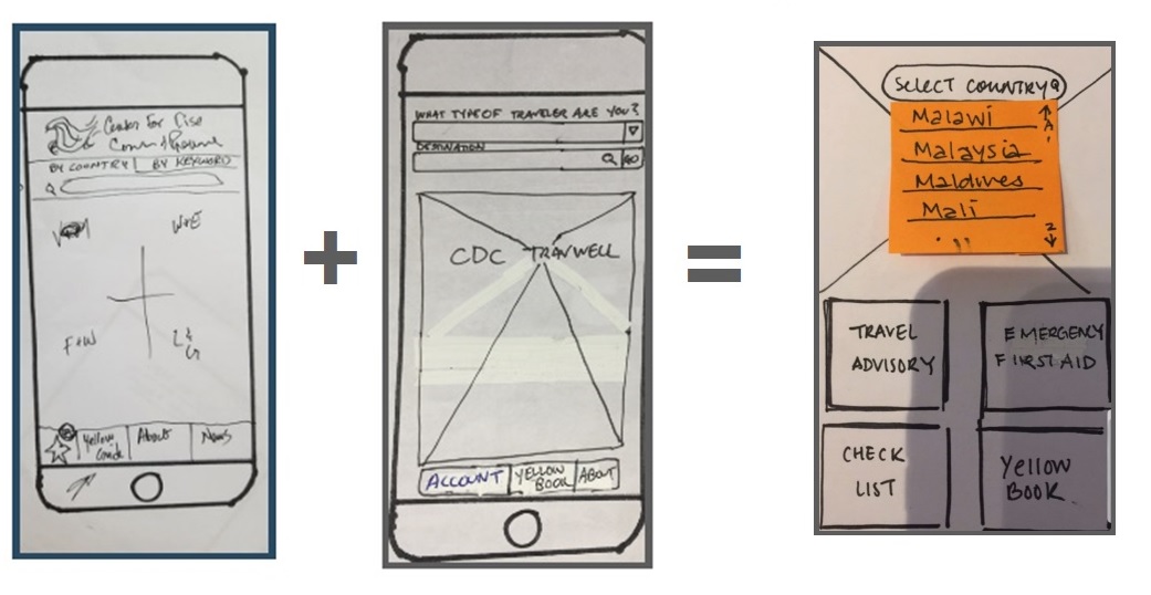
Sketching the app and determining the layout our team’s first debate. We needed to align our ideas in one direction so we utilized a design studio:
Coming up with the home page was one of the biggest debates for our team. We all had different ideas of how the home page should be designed, which sets the structure for the rest of the app. To find a solution, we decided to have a design studio. We all sketched up our own version of the home page and then presented it to each other. After each presentation, we discussed what we found effective, what we didn’t, and why. This led to a merging of ideas and ultimate home page creation and flow of our app.
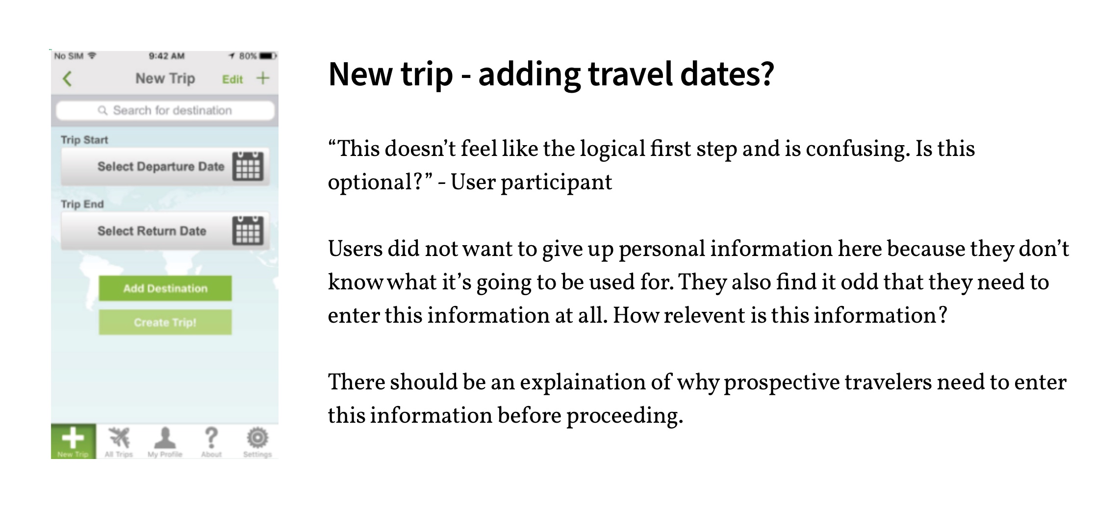
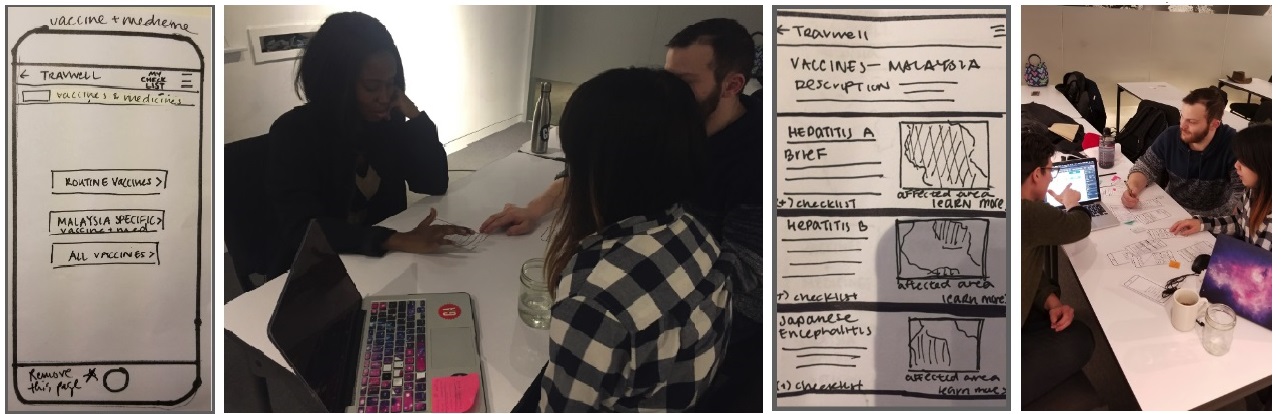
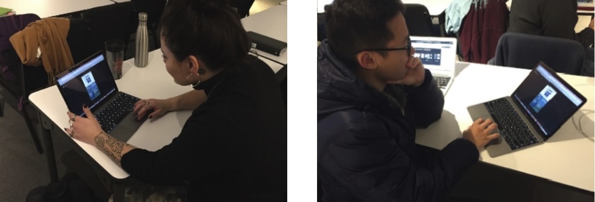
Paper prototype user testing
My partner sketched our screens and we conducted usability tests to find out what we did well and what we need to change. We used a paper prototype for our first round of usability tests. We took turns playing director, note taker, and computer roles.
User’s scenario– It’s your first time traveling internationally to Malaysia and you’re worried about getting sick, especially with regard to unfamiliar and exotic diseases. To best prepare, your colleague recommended that you check out this CDC TravWell app that she had used.
Feedback and iterations
“The Flow is clear. The vaccine page’s layout and structure is clear.”
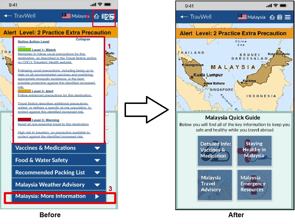
Feedback: Improve the alert system because it doesn’t stand out. It is buried under travel notifications. Perhaps include all three alerts and just highlight the ones that is relevant
Solution: To solve this problem we moved the alert bar from the notifications section to an alert bar on the country home page
Feedback: Make checklist more accessible in the navigation bar?
Solution: This was an easy one, we created an icon in the header and like a shopping cart it populates with the number for each saved piece of information
“I really just want to know what is mandatory and what is not. What do I need to do?”
Feedback: Found a lack of understanding of the ‘essential’ information for users to know before traveling.
Solution: This stirred up a bunch of different ideas for a solution but because of the scope of the project and it’s two-week time frame we came up with a quick and logical solution. We added a brief explanation to the country homepage stating “Quick travel guide to Malaysia, below you will find all the key information to keep you safe and healthy…”
Transition to high-fidelity
- We developed the initial color guide and high fidelity look and shared it with me for reference and to build it out further
- We split up the work for this part and discussed edits and synthesized the halves the best we could.
- Due to technical issues, both of my partners lost their ability to use Sketch during this time. I took my partner’s screens and my own and I added the content to them all.
- Another partner implemented gestures and interactions in InVision.
Mid-fidelity High-fidelity
Round two of usability testing
Round two feedback
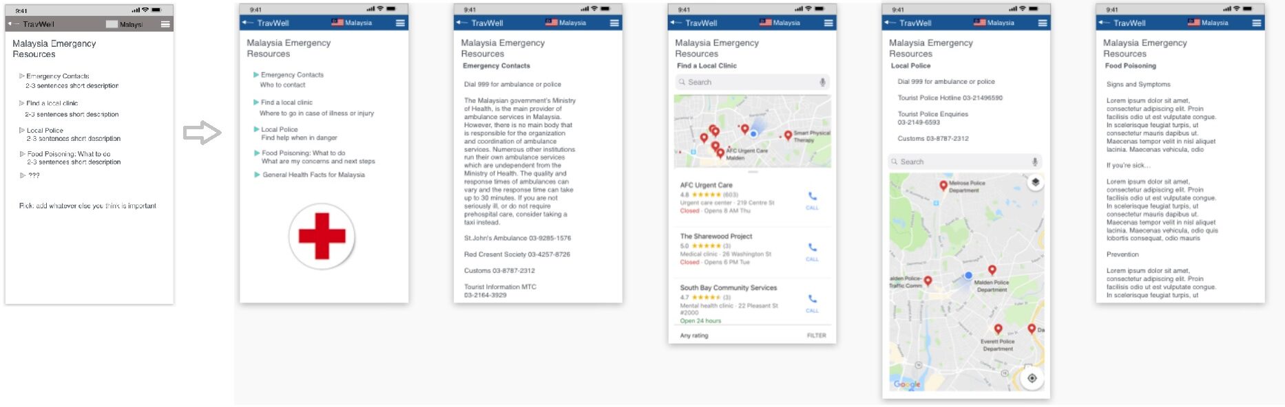
Feedback: Travel alert ticker did not give user the information they wanted to know when they clicked on it. The drop-down originally informed user about what the differences were between green, orange and red statuses were instead of informing the user what the actual alert is about. In this case, the alert is about rabies.
Solution: To solve this problem, we got rid of the drop-down and linked the alert bar directly to the information about rabies screen.
Feedback: “More information” button was confusing. Our user wanted information from that section to be more upfront and center.
Solution: We ended up merging this page with a different one to make more sense for our users.
Feedback: The checklist icon didn’t look like a checklist. Not aware of when something was ‘added to checklist’ feature.
Solution: We did not get a chance to change this icon but would love to test different icons among users to discover which icon made the most sense to users.
Reflection
My previous work in UX Design was done individually so working with a group gave me a new experience. I enjoyed working with my team and making decisions with their perspectives in mind. I believe our work resulted in a higher quality of work than what I can do on my own because of the added input from my teammates. Forming chemistry is always an essential to group work and I believe we achieved a solid working relationship with this project.
Update
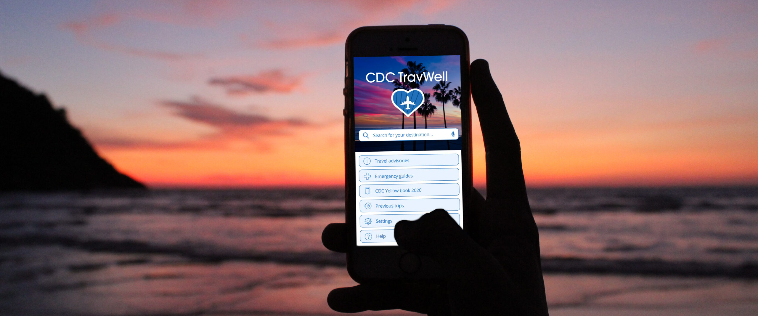
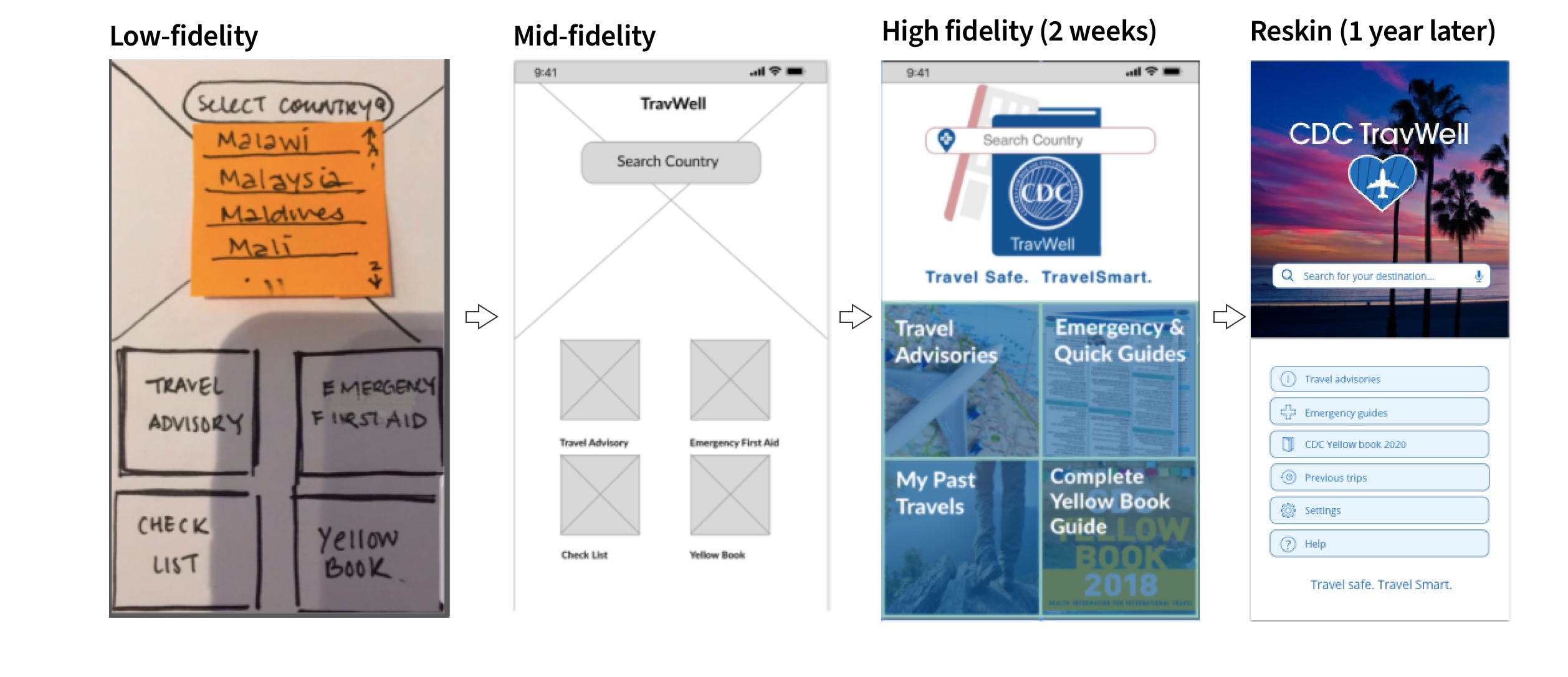
After a year had passed, I came back and added a loading page and redesigned the home page for this app. I wanted to see how these pages would look after all I have learned one year out. I also created a new logo for this app which turned out really nice I think. My process below:
Updated loading screen and home screen:
